
Tab Information
Package: BASIC
1. General
The structure of the detail view is the same or very similar in most modules (exceptions include modules such as Reports, Email Accounts or Templates).
The detail view of a record is divided into three tabs:
- Information → Display of fields grouped in blocks, plus various actions
- Relations → Display of linked (referenced) records grouped in blocks, plus various actions
- Dashboard → Display of freely configurable widgets
The detail view in the Information tab is fundamentally divided into several "blocks". A "block" is generally a summary of several thematically related fields.
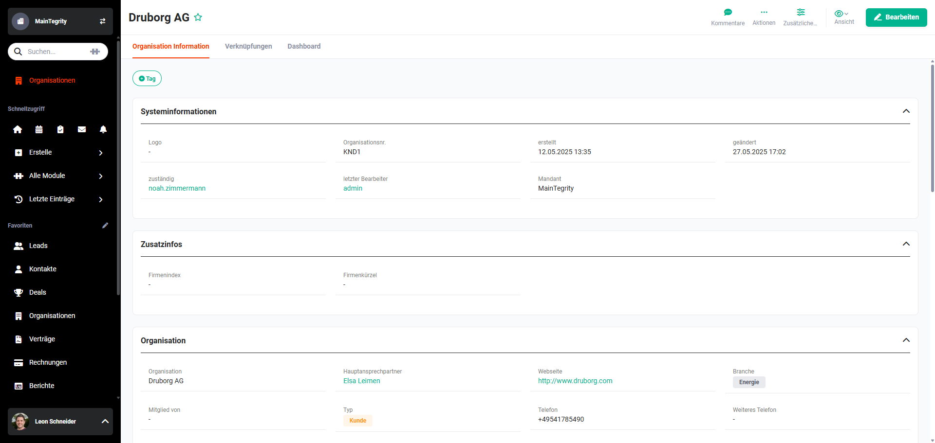 Detail View – Tab Information
2. Views
In the detail view, customised views can be created in which it can be precisely defined which fields/blocks are displayed or hidden and how they are positioned.
Customised views can be configured in Global Settings – Module Management – Layout.
Switching between views is done via the Views button.
3. Blocks and Fields
The following descriptions are based on the "Standard" view.
Due to the possible individual configuration options for views, custom-created views may have a completely different configuration.
3.1. Blocks
The detail view in the Information tab is fundamentally divided into several "blocks". A "block" is generally a summary of several thematically related fields.
Blocks can be hidden/collapsed in a view using the hide action icon (upward-pointing angle bracket icon) — which is positioned in the top right corner of each block.
3.1.1. System Information Block
The "System Information" block is available as standard in almost all modules.
The block contains the following fields by default:
- Record No. → System-internal record number (e.g. contact number, account number). The numbering can be individually configured in Global Settings – Basic Setup – Company Information – Record Numbers.
- Responsible → User or group responsible for the record.
- Created → Date and time when the record was created.
- Modified → Date and time when the record was last modified (see also Change Tracking). The Modified field is only updated when an actual field change has been made to the record.
- Last Editor → User or group who last edited the record.
3.1.2. Module Fields Block
The "Module Fields" block is generally named after the respective module, e.g. "Contact", "Account" or "Lead".
This block contains the "main information" of the record.
In the Contacts module, these are fields such as salutation, first name, last name, account, email, direct phone, mobile, etc.
3.1.3. Address / Delivery Address Block
The "Address / Delivery Address" block is available by default in the following modules:
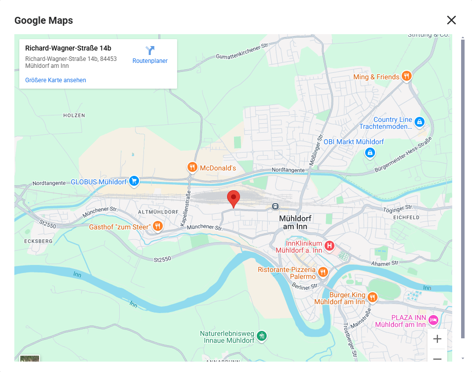
In the Contacts, Accounts, Leads and Partners modules, the "Show Address on Map" button is available in the "Address" block.
After clicking the button, a flyout menu opens in which you can select whether to use the billing address or the delivery address.
After selecting the address to be used, the "Google Maps" popup window opens, displaying the address on a Google Maps map.
3.1.4. Additional Blocks
Depending on the module, additional blocks are available in the "Standard" view, such as:
- Additional Information
- Bank Details
- Account-Related Data (module Contacts)
- Forecast (module Deals)
- Position Group (see Product Block in Billing Modules)
3.2. Fields
Fields display data values. There are many different field types:
- Text → Standard text field
- Number → Field for numeric values; decimal places possible
- Percentage → Field for percentage values
- Currency → Field for selecting currencies (see Module Management – Basic Setup – Currencies)
- Date → Field for date values
- Email → Field for email addresses (validated for correct syntax on save and displayed as a hyperlink)
- Phone → Field for phone numbers (displayed as a hyperlink once telephony has been connected to brainX — see Module Management – Special Module Settings – Connect)
- Fax → Field for fax numbers (displayed as a hyperlink once telephony has been connected to brainX — see Module Management – Special Module Settings – Connect)
- Picklist → Field with defined picklist values (see Module Management – Layout – Custom Fields)
If colours are configured for the picklist values, these are also displayed outside the detail view – for example in the Relations tab of linked records as well as in selection pop-ups. - Reference → Using a Reference field, existing records from other modules can be selected, creating references (links) to other modules
- URL → Field for a URL/web address (displayed as a hyperlink)
- Checkbox → Toggle/checkbox with yes/no or checked/unchecked values
- Text Area → Unlike the Text field type, the Text Area field type is not limited to 100 characters; it can process and store considerably more characters. Depending on the configuration, HTML formatting of the text is also possible.
- Multi-Select Box → Identical to the Picklist field type, but with the difference that multiple picklist values can be selected simultaneously.
- File → The field allows files to be uploaded into the brainX system
- User Selection → Field for selecting (active) brainX Users/Groups. Fields of the User Selection type display the user's profile picture next to their name — if one has been stored. If no profile picture is available, the user's initials are shown.
Note: Fields of the User Selection type are empty by default — no user is pre-selected. Exception: the Responsible field, which is automatically pre-filled with the currently logged-in user when a record is created.