
Dashboard Widgets
Package: BASIC
1. General
Widget: A control or operating element (graphical control element or widget) is an interaction element in a graphical user interface (GUI).
Any number of widgets can be added within a dashboard. It is also possible to create the same widget — e.g., Module List View — multiple times within a dashboard.
The size and position of widgets are freely configurable.
2. Widget Actions
The following actions are available for widgets:
2.1. Add Widget
To add a widget to a dashboard, click the Add Widget button.
If no widget exists in a dashboard yet, in addition to the Add Widget button — which is always displayed in the top right of the dashboard — the notice "Your dashboard does not yet contain any widgets" including the Add Widget button is displayed:
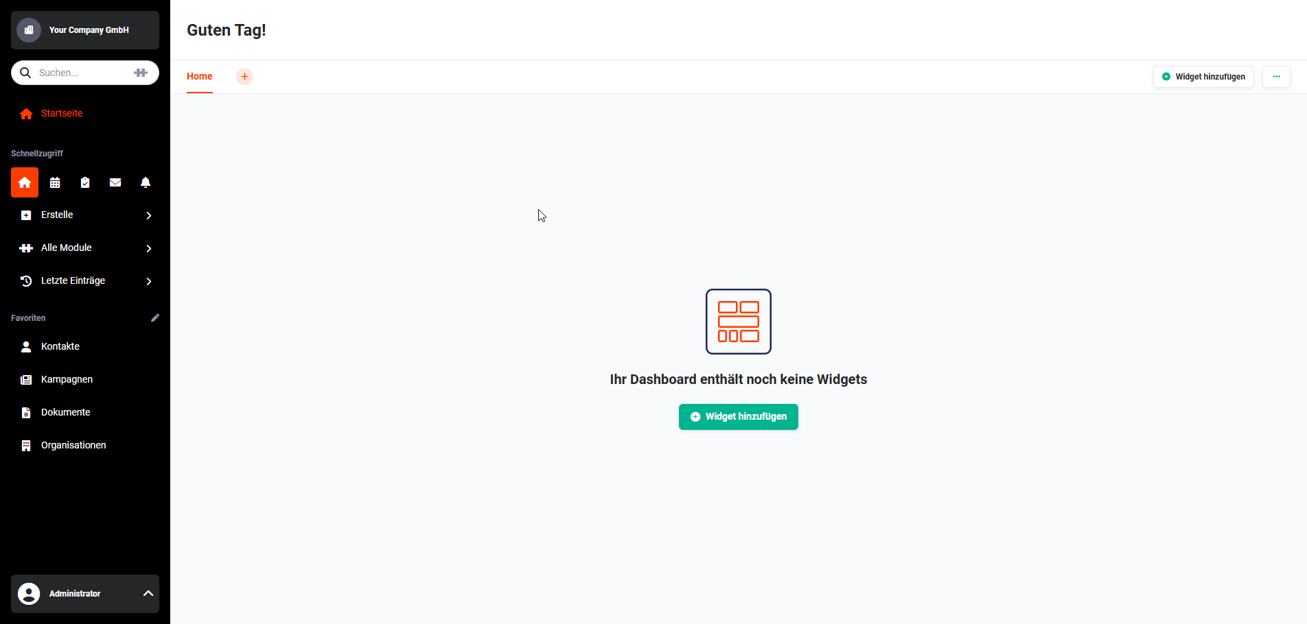 Dashboard without widgets
After clicking the button, the Add Widgets popup opens, listing all available widgets:
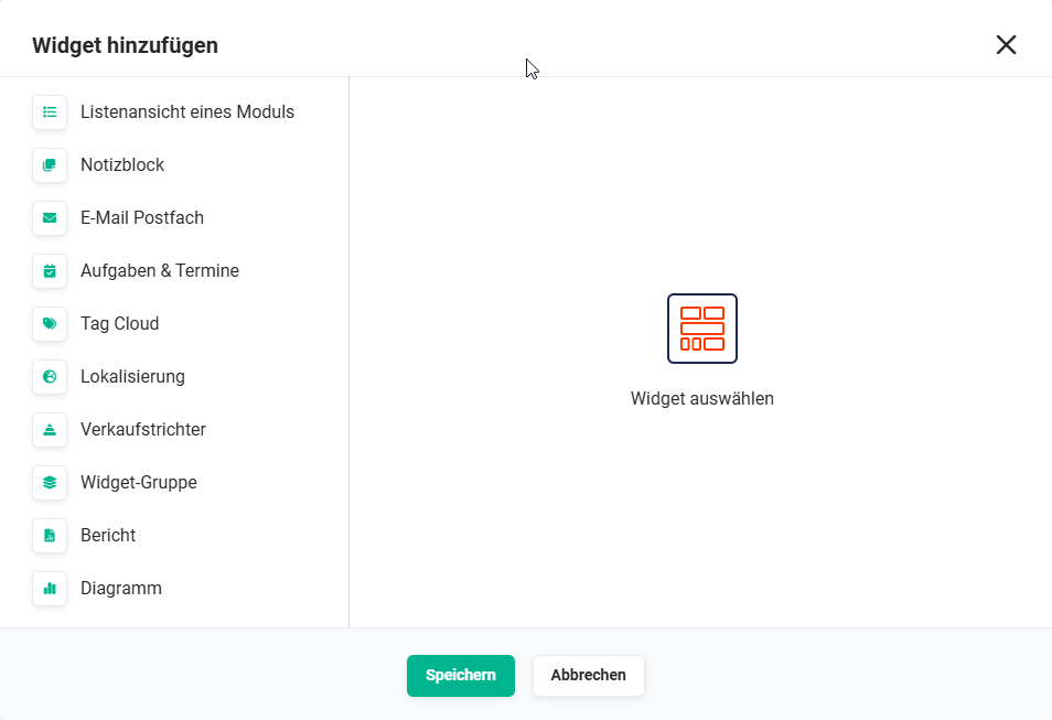 Add Widget popup
The following widgets are available for a dashboard:
- Module List View
- Notepad
- Email Inbox
- Tasks & Appointments
- Tag Cloud
- Localization
- Sales Funnel
- Widget Group
- Report
- Chart
- Cashflow
After selecting a widget by clicking it, the configuration of the respective widget is displayed in the popup.
For detailed information on the configurations of the respective widgets, see the section Available Widgets.
2.2. Edit Widget
Each widget has the three dots actions icon in the top right corner:
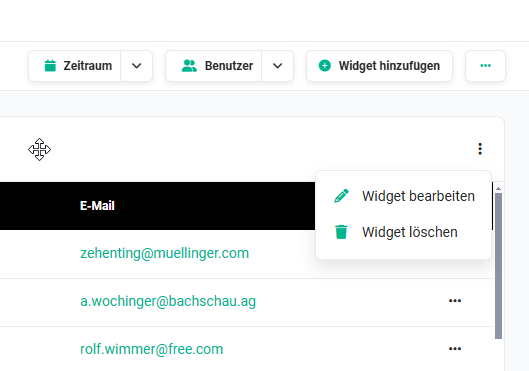 Action: Delete Widget
After clicking the icon, a flyout menu opens with the actions:
- Edit Widget
- Delete Widget
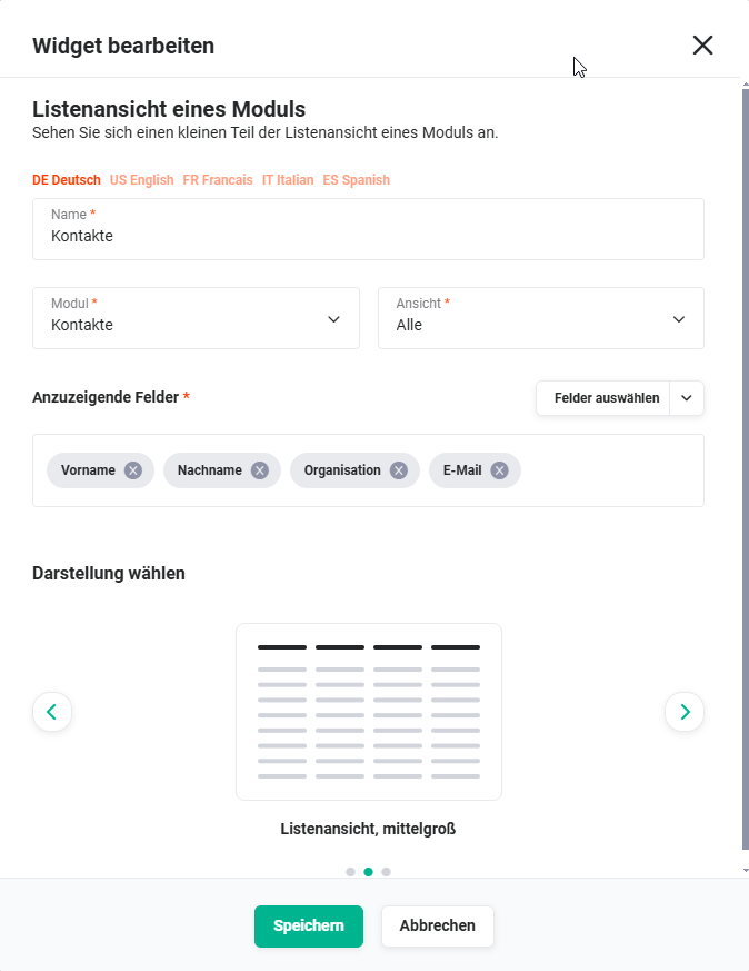 Edit Widget
When editing a widget, more or less the same functionality is available as when creating a widget. See the section Available Widgets for details.
The Delete Widget action is described in the Delete Widget section.
2.3. Delete Widget
Each widget has the three dots actions icon in the top right corner:
Action: Delete Widget
After clicking the icon, a flyout menu opens with the actions:
- Edit Widget
- Delete Widget
After clicking the Delete Widget action, a popup window is displayed asking whether the widget should be permanently deleted:
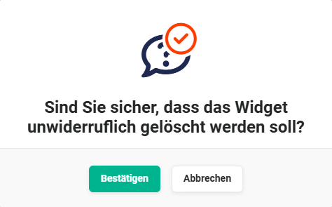 Delete Widget popup
After clicking the Confirm button, the widget is deleted.
If a widget was accidentally deleted, for example, the widget cannot be restored and must be recreated!
2.4. Widget Size
The size of a widget can be changed in two ways:
- Edit Widget → in the Choose Display area, select the desired widget size (small, medium, or large)
- The widget can be resized by "dragging" in width and height. To do this, move the mouse pointer over the bottom right corner of the widget. The mouse pointer changes to a diagonal double arrow. With the mouse button held down, the widget can now be dragged to the desired size. During this process, the content of the widget is hidden and the possible sizes are shown with a dashed border. After releasing the mouse button, the size is changed accordingly and the widget is permanently saved with the new size.
2.5. Widget Position
The position of a widget can be changed via Drag & Drop.
To do this, move the mouse pointer over the header of the widget. The mouse pointer changes to the "Move Cursor" (four arrows).
With the mouse button held down, the widget can now be dragged to the desired position.
During this process, the content of the widget is hidden and the possible positions are shown with a dashed border.
After releasing the mouse button, the position is changed accordingly and the widget is permanently saved with the new position.
Depending on how many widgets are already on the dashboard, they may automatically be moved to a different position during the move operation.
It may be necessary to repeat the move operation several times until all widgets are in the desired position.
3. Available Widgets
The following widgets are available for a dashboard:
- Module List View
- Notepad
- Email Inbox
- Tasks & Appointments
- Tag Cloud
- Localization
- Sales Funnel
- Widget Group
- Report
- Chart
- Cashflow
A widget can also be added multiple times within a dashboard.
The title of a widget can be configured in multiple languages when creating or editing a widget. Above the Name input field, there are tabs for the respective languages. If the widget title is not explicitly translated into other languages, the German name is displayed by default if a user selects a different language.

3.1. Module List View
The Module List View widget displays records from a module.
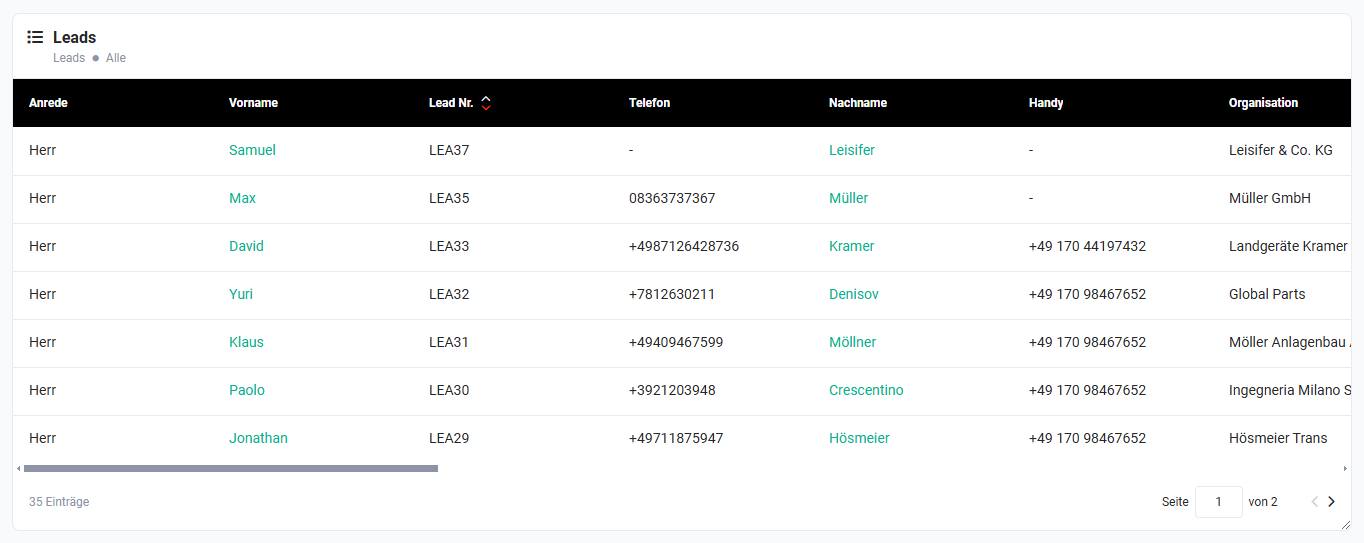 Module List View Widget
After selecting the widget, the configuration settings appear as follows:
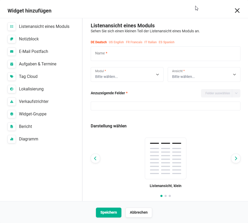 Module List View Widget Configuration
| Field | Description |
|---|---|
| Name* | Name of the widget |
| Module* | Select the module from which records should be displayed. |
| View* | Select the view (list view) |
| Fields to Display* | Select the fields to be displayed using the "Select Fields" button. Selected fields can be rearranged after selection via Drag & Drop. |
| Choose Display |
|
*Required field
3.2. Notepad
The Notepad widget allows short notes to be saved so they are always visible.
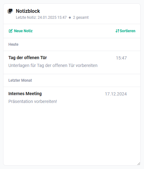 Notepad Widget
After selecting the widget, the configuration settings appear as follows:
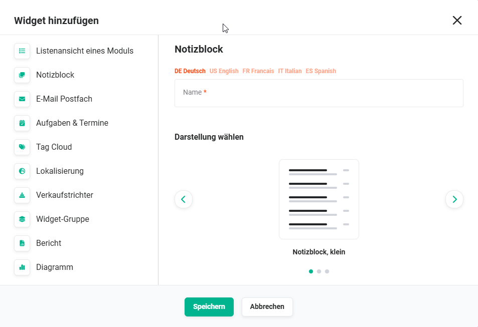 Notepad Widget Configuration
| Field | Description |
|---|---|
| Name* | Name of the widget |
| Choose Display |
|
*Required field
3.3. Email Inbox
The Email Inbox widget allows an inbox to be selected to get a quick overview of emails.
After selecting the widget, the configuration settings appear as follows:
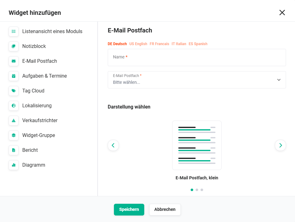 Email Inbox Widget Configuration
| Field | Description |
|---|---|
| Name* | Name of the widget |
| Email Inbox* | Selection list of inboxes that have already been set up in the Email accounts module. |
| Choose Display |
|
*Required field
3.4. Tasks & Appointments
The Tasks & Appointments widget can display tasks and/or appointments to provide, for example, a quick overview of current tasks and appointments.
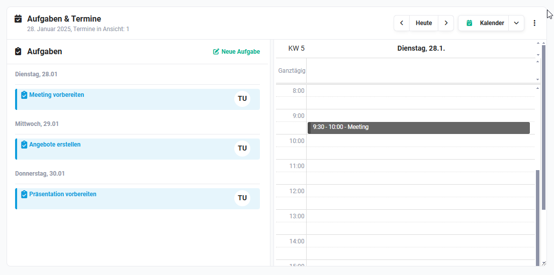 Tasks & Appointments Widget
After selecting the widget, the configuration settings appear as follows:
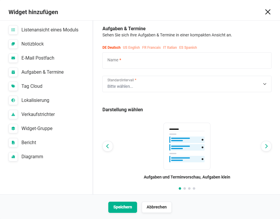 Tasks & Appointments Widget Configuration
| Field | Description |
|---|---|
| Name* | Name of the widget |
| Default Interval* |
|
| Display |
|
*Required field
The Tasks & Appointments widget only displays the user's own tasks by default. Tasks of specific groups can be shown via a popup.
After clicking the Groups actions icon (User Group icon), a flyout menu opens. In this menu, the tasks of all groups the user belongs to can be selected for display using a toggle.
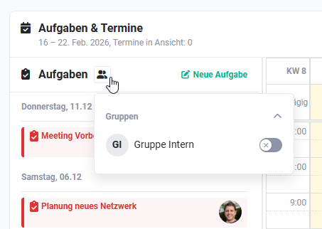 Tasks & Appointments Widget — Select Groups
The setting for displaying group appointments is only temporarily valid. It only applies as long as no other tab on the Dashboard is opened or the Dashboard is not left entirely.
When a task is marked as completed in the tasks widget — both in the standalone tasks widget and in the combined view — it is automatically hidden.
3.5. Tag Cloud
The Tag Cloud widget can be used to display tags from the system.
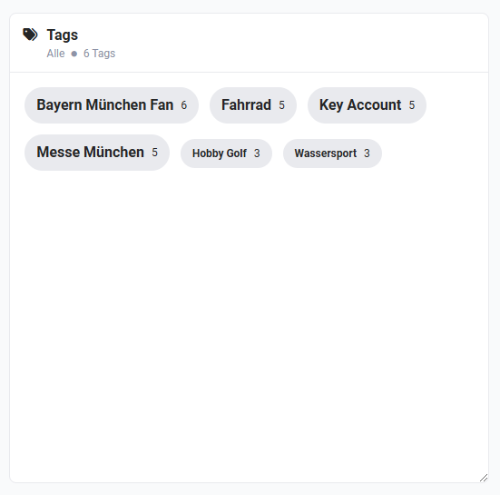 Tag Cloud Widget
Regardless of which view (dynamic or static) was selected for the widget: clicking a tag performs a search for records that are marked with this tag.
The found records are then displayed clearly, module by module, in a list view.
After selecting the widget, the configuration settings appear as follows:
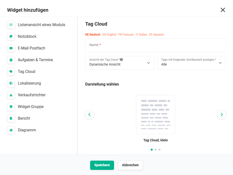 Tag Cloud Widget Configuration
| Field | Description |
|---|---|
| Name* | Name of the widget |
| Tag Cloud View* |
|
| Show tags with the following visibility* |
|
| Display |
|
*Required field
3.6. Localization
The Localization widget shows the distribution of contacts, organizations, leads, and partners on a map.
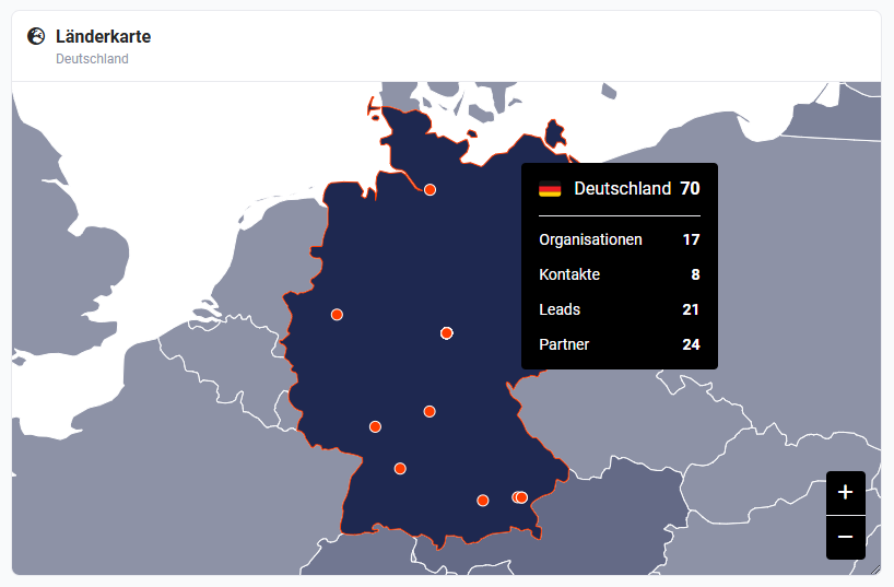 Localization Widget
After selecting the widget, the configuration settings appear as follows:
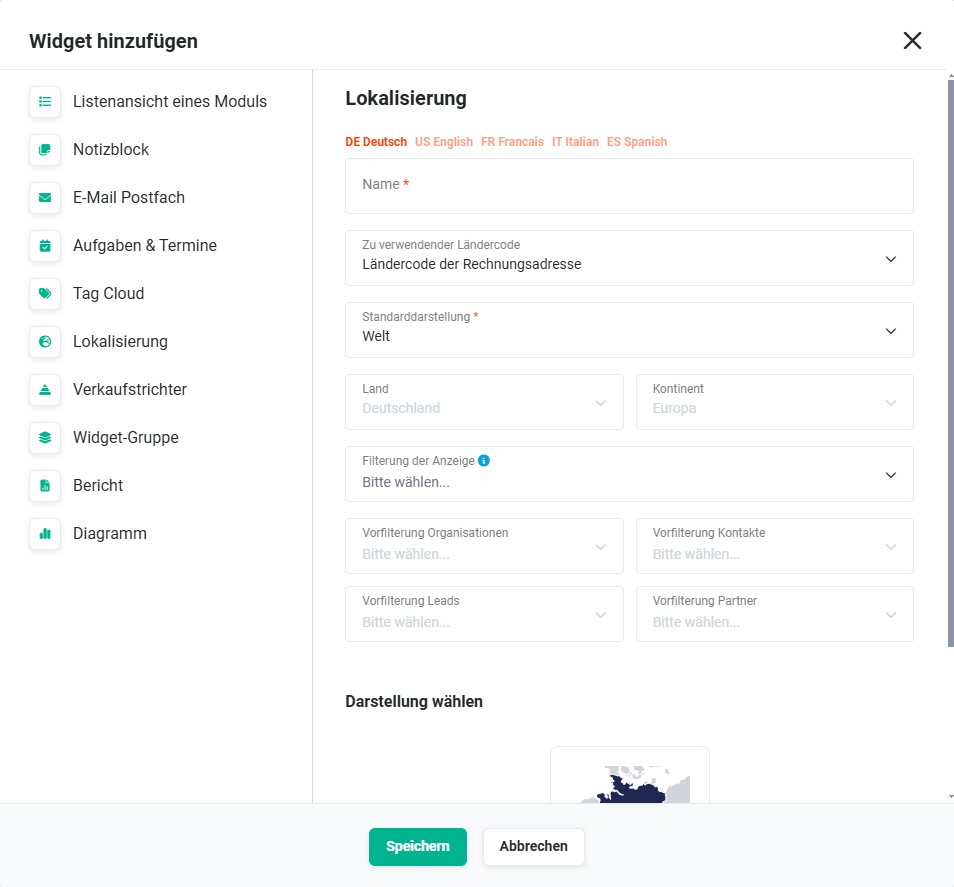 Localization Widget Configuration
| Field | Description |
|---|---|
| Name* | Name of the widget |
| Country code to use |
|
| Default Display* |
|
| Country | Select the country to be used for the display.
The selection is only available if the value Country was selected in the Default Display field. |
| Continent | Select the continent to be used for the display.
The selection is only available if the value Continent was selected in the Default Display field. |
| Display filter |
|
| Pre-filter Organizations | Select a custom list view of the Organizations module that can be used as a filter.
A selection can only be made if the Organizations module was selected in the Display filter field. |
| Pre-filter Contacts | Select a custom list view of the Contacts module that can be used as a filter.
A selection can only be made if the Contacts module was selected in the Display filter field. |
| Pre-filter Leads | Select a custom list view of the Leads module that can be used as a filter.
A selection can only be made if the Leads module was selected in the Display filter field. |
| Pre-filter Partners | Select a custom list view of the Partners module that can be used as a filter.
A selection can only be made if the Partners module was selected in the Display filter field. |
| Display |
|
*Required field
In the Localization widget, no locations are displayed in the default display Continent / World.
Locations are only displayed when a country is selected. To do this, click on the country on the map, or select a country from the list in the wide widget. Zooming into the map is not sufficient. The widget setting Country automatically selects the chosen country. The setting World or Continent initially shows no locations.
3.7. Sales Funnel
The Sales Funnel is a graphical representation of totals from the Deals, Orders, and Invoices modules.
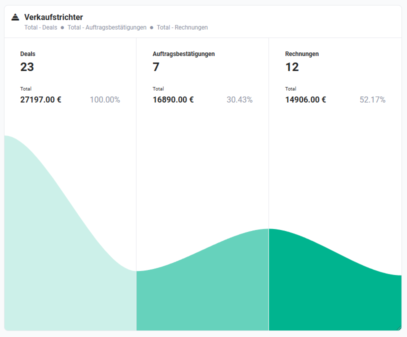 Sales Funnel Widget
Which fields serve as the basis for the summation can be configured individually for each module.
After selecting the widget, the configuration settings appear as follows:
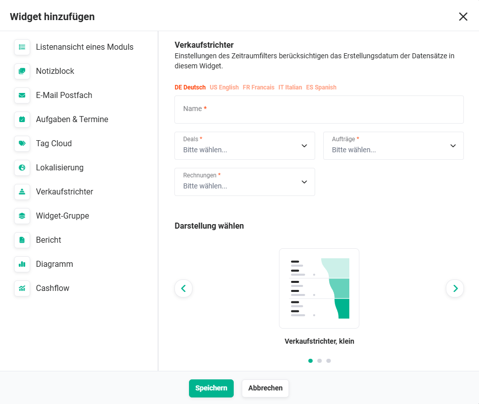 Sales Funnel Widget Configuration
| Field | Description |
|---|---|
| Name* | Name of the widget |
| Deals* | All currency fields of the module are available here, which serve as the basis for forming the sum. |
| Orders* | All currency fields of the module are available here, which serve as the basis for forming the sum. |
| Invoices* | All currency fields of the module are available here, which serve as the basis for forming the sum. |
| Display |
|
*Required field
If the dashboard Time Period Filter is used, the creation date of the records serves as the basis for the filter.
3.8. Widget Group
The Widget Group widget offers the ability to display multiple widgets within a single widget.
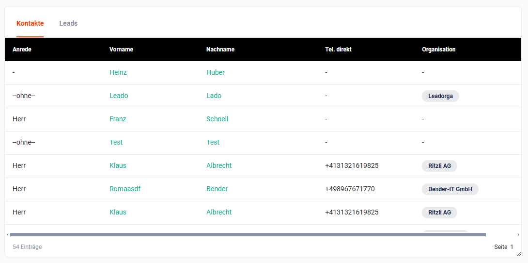 Widget Group Widget
After selecting the widget, the configuration settings appear as follows:
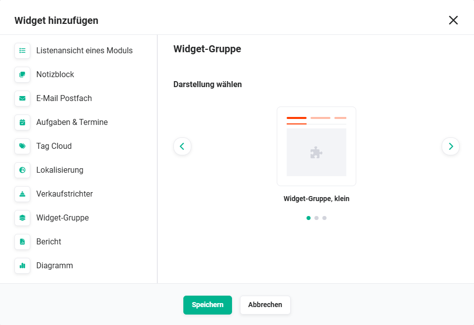 Widget Group Widget Configuration
| Field | Description |
|---|---|
| Choose Display |
|
Apart from setting the display, no further settings can be made when creating the widget.
Widgets can be dragged into and out of a Widget Group via Drag & Drop to add them to or remove them from a Widget Group.
3.9. Report
The Report widget displays the records of any report from the module of the same name.
A report can be displayed or exported directly using the corresponding action:
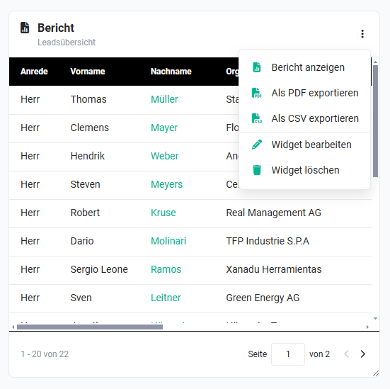 Report Widget — Actions
After selecting the widget, the configuration settings appear as follows:
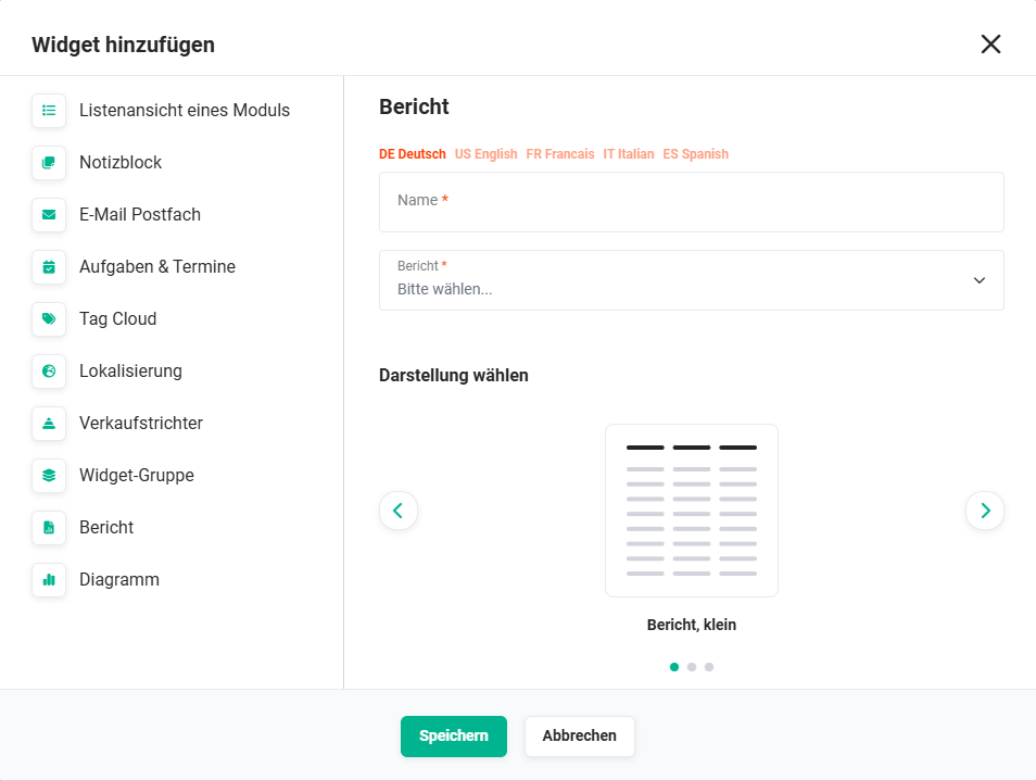 Report Widget Configuration
| Field | Description |
|---|---|
| Name* | Name of the widget |
| Report* | Selection list of all available reports from the Reports module |
| Display |
|
*Required field
3.10. Chart
The Chart widget enables the display of a chart that was configured in the list view of a module.
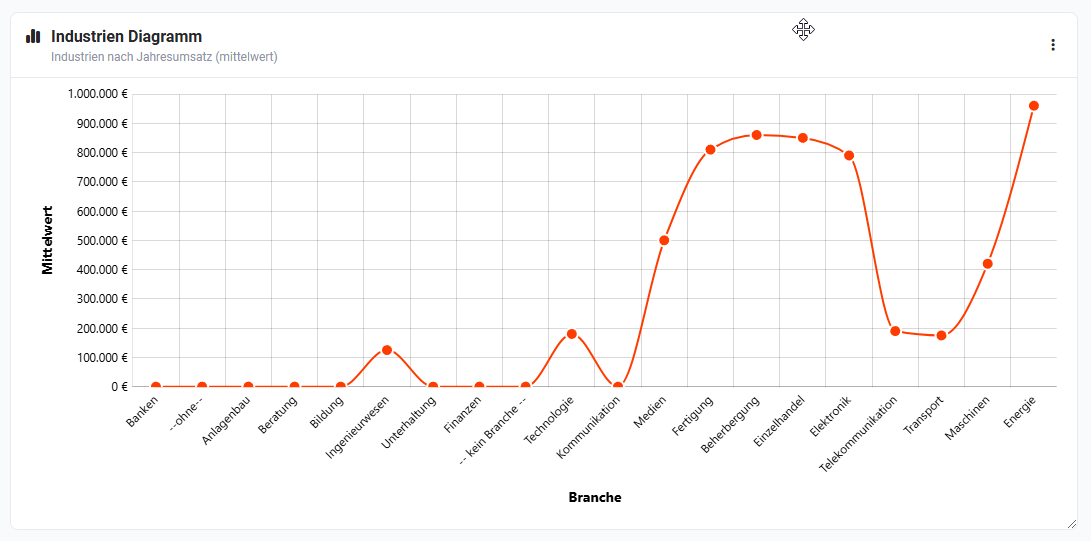 Chart Widget — Line Chart
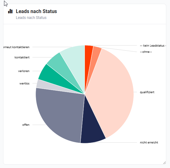 Chart Widget — Pie Chart
After selecting the widget, the configuration settings appear as follows:
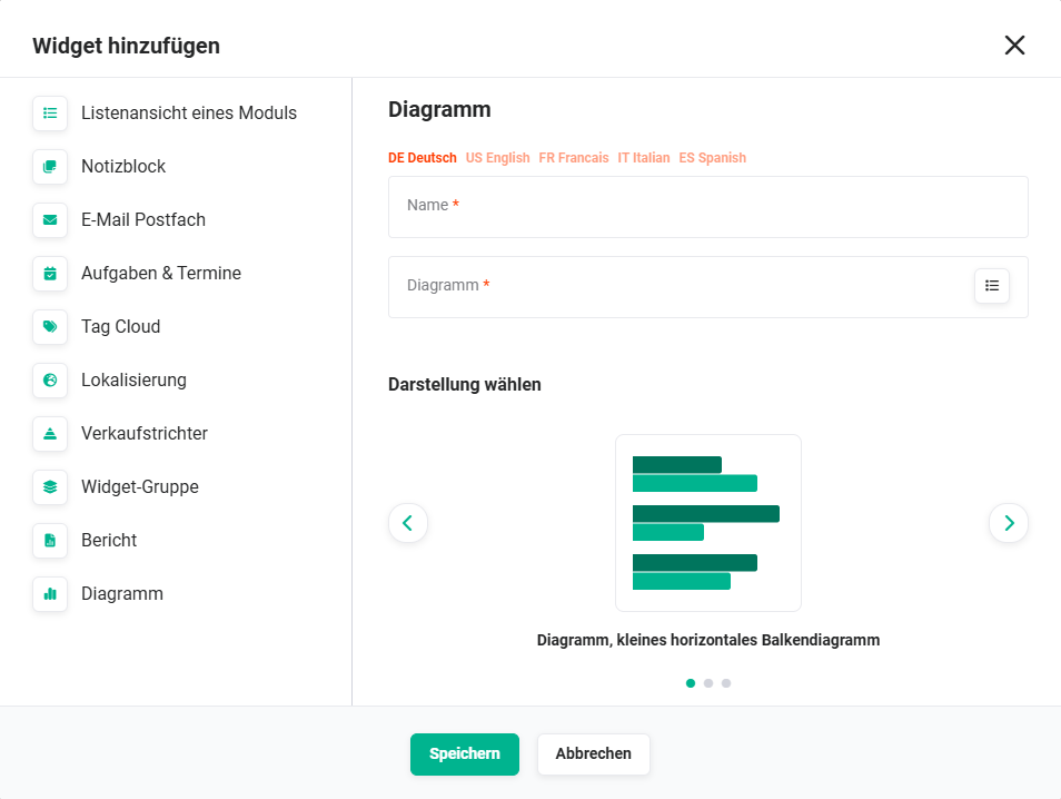 Chart Widget Configuration
| Field | Description |
|---|---|
| Name* | Name of the widget |
| Chart* | Select the chart (see screenshot below) |
| Display |
|
*Required field
Selecting the chart: After clicking the List actions icon in the Chart field, the Charts popup window opens, in which a chart can be selected for display in the widget:
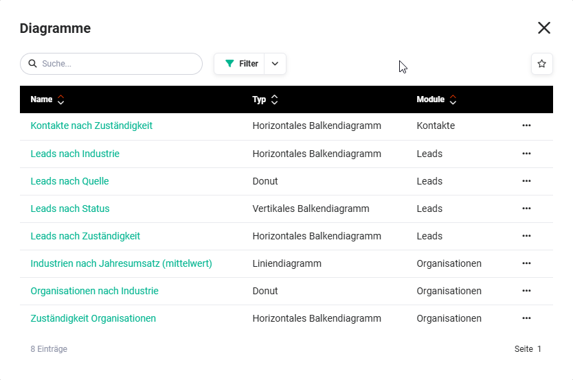 Charts popup
Special action Maximize Widget for charts: When editing a widget, the Maximize Widget action is available for the Chart widget in addition to the Edit Widget and Delete Widget actions.
This action allows a chart to be displayed maximized in a separate popup window:
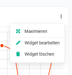 Chart Widget — Maximize Action
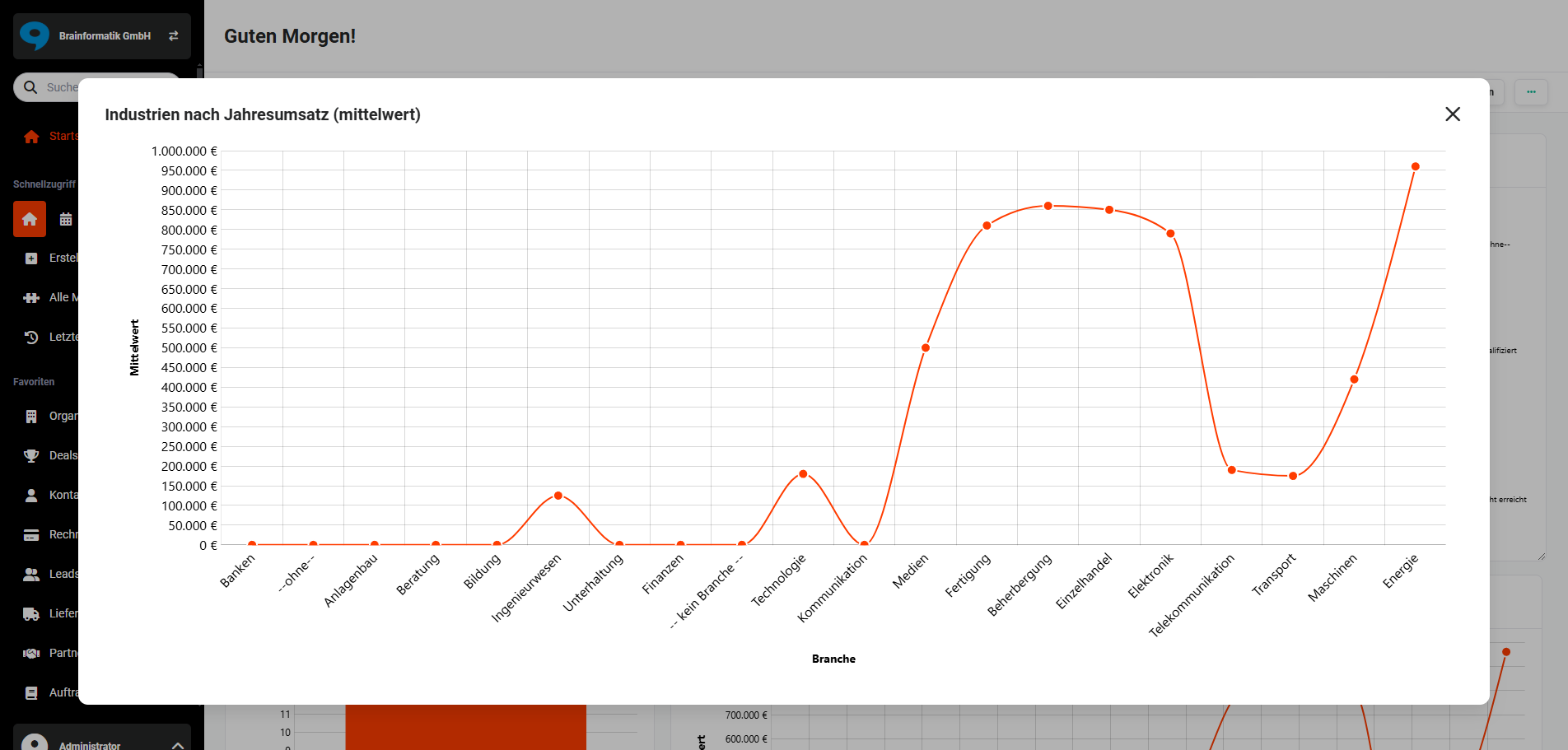 Chart Widget maximized
3.11. Cashflow
The Cashflow widget is exclusively available in the CRM version brainX APP!
Overview
The Cashflow widget shows a forecast of future income and expenses over a defined time period.
It is designed to provide a quick overview of a company's expected liquidity development.
The display is based on data from several system modules:
- Contracts (recurring revenues)
- Invoices
- Planned deposits
- Deals from the sales pipeline
- Planned costs from the controlling module Controllix
The widget particularly helps management, sales, and controlling to identify and assess future cash flow developments at an early stage.
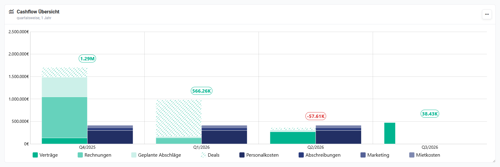 Cashflow Widget
How it Works
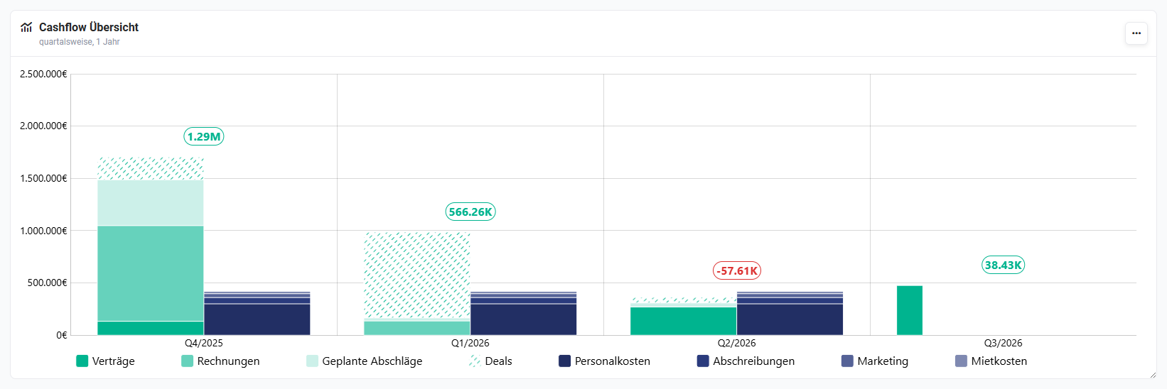
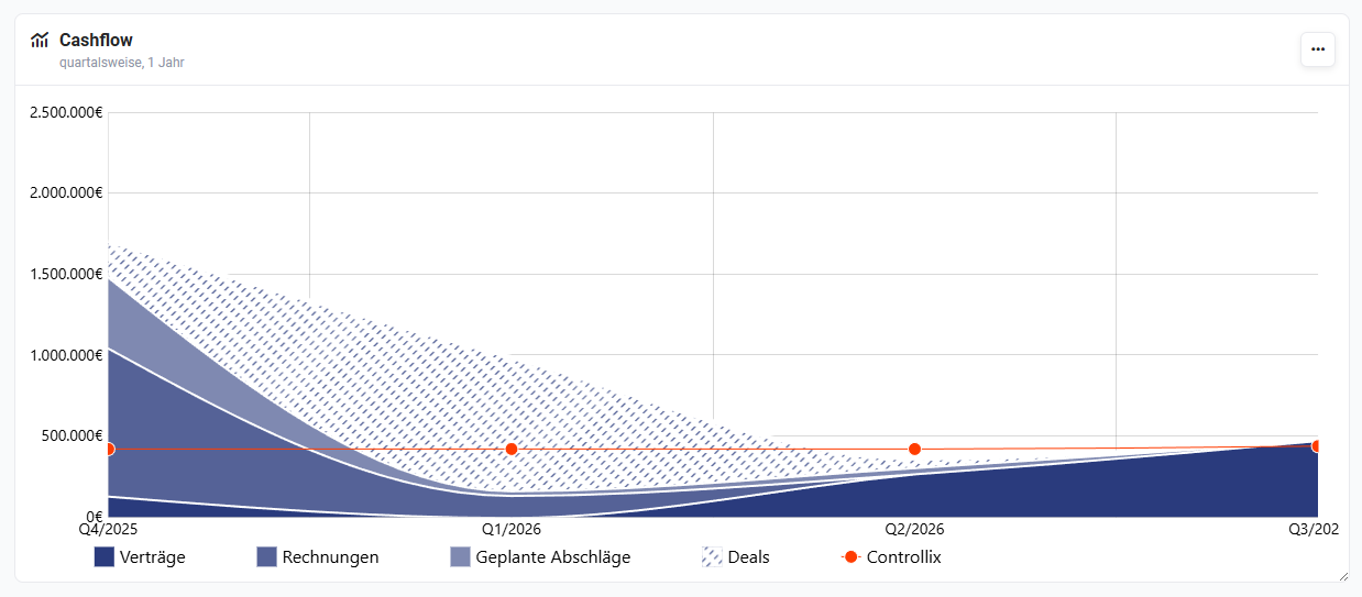
The chart compares income and expenses per time period. This results in the expected cash flow.
Income can come from the following sources:
- Contracts: recurring revenues from active contracts
- Invoices: already invoiced revenues
- Planned deposits: planned installment payments from projects
- Deals: potential revenue from open sales opportunities
Deals are shown with a dashed line in the chart, as they represent potential and not yet secured revenue.
Expenses come from the Controllix module and may include, for example:
- Personnel costs
- License costs
- Marketing costs
- Rent
- Depreciation
- Other operating costs
Cashflow Calculation
The cash flow is automatically calculated per time period:
- Cash flow = Income – Expenses
The result is highlighted in the chart:
- Green: positive cash flow (surplus)
- Red: negative cash flow (deficit)
This allows critical time periods to be quickly identified.
Chart Types
The Cashflow widget can be displayed in three different chart types:
- Bar chart → Income and expenses are displayed as bars per time period. This display is particularly suitable for direct comparison of individual periods.
- Area chart → The development of income and expenses is visualized as an area over time. This display is particularly suitable for recognizing trends and developments over longer time periods.
- Tabular display → Income and expenses are listed at record level in a table. Each record appears as a single row with full date — no aggregation by month or quarter takes place. Separate CSV exports are available for income and expenses, which can be opened directly in Excel. This display is particularly suitable when the exact due date of individual items is the focus.
Widget Configuration
After selecting the widget, the configuration settings appear as follows:
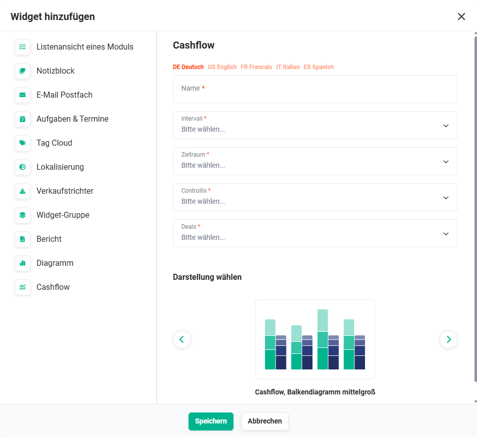 Cashflow Widget Configuration
| Field | Description |
|---|---|
| Name* | Name of the widget |
| Interval* |
|
| Time Period* |
|
| Controllix* | Controls whether planned costs from the Controllix module are included in the chart. |
| Deals* | Determines whether open deals from the sales pipeline are included in the cash flow forecast. |
| Filter for Deals |
|
| Choose Display |
|
*Required field
On mouseover, a flyout window displays details on income and expenses for the respective time period.
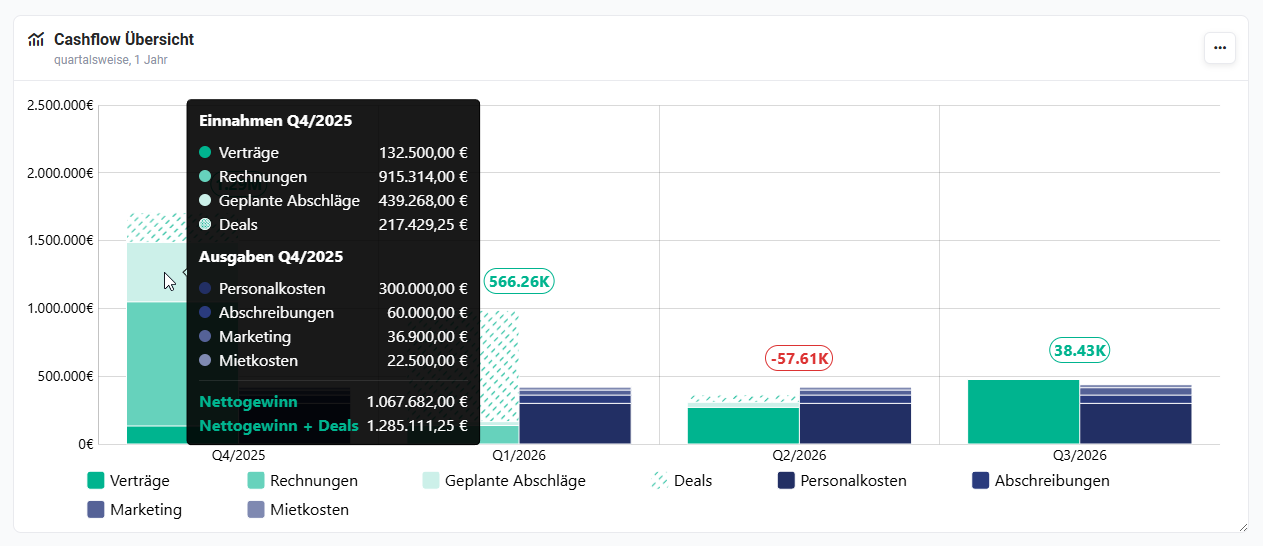 Cashflow Widget — Income and Expense Details
Typical Use Cases
- Liquidity planning → Management can identify early on in which time periods liquidity surpluses or bottlenecks may arise.
- Sales management → The sales team can see what impact pipeline deals will have on future liquidity.
- Budget planning → Controlling can analyze how planned costs affect cash flow and whether adjustments are necessary.