
Automations - Configure Workspace
Package: BASIC
1. Special Functionalities
When creating or editing an automation, there are special functionalities that are available in various places.
For the sake of clarity, these functionalities are described centrally at this point.
1.1. Configure Workspace - Set Value
The popup "Set value" for the functionality "Configure workspace" is available in the following areas:
- Node "Condition" → Step 4 - Select comparison when inserting the node "Condition"
- Node "Action" → Update record → Step 1a - Configure workspace when inserting the node "Action"
- Node "Action" → Create record → Step 1a - Configure workspace when configuring fields after selecting an object type (module)
- Node "Action" → Add item → configuration of fields in the item information and custom fields
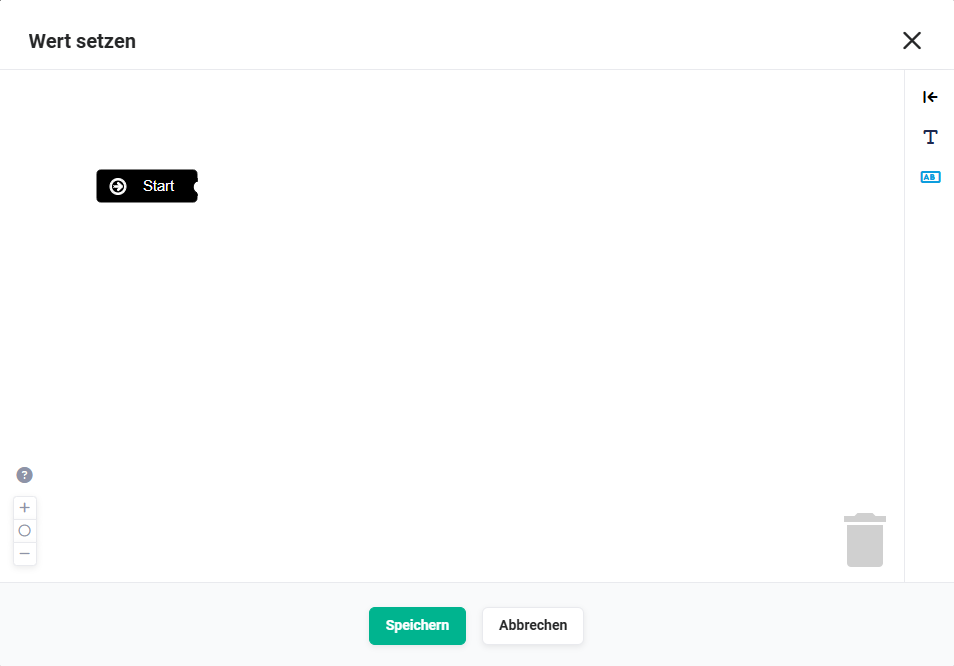 Example node "Condition" - Configure workspace - Popup "Set value"
1.1.1. Editor Actions
In the editor of the popup "Set value", the same or similar action icons as in the automation editor itself are available:
- Zoom in
By clicking the action icon "Zoom in" (icon "Plus"), the view is enlarged. - Fit zoom to size
By clicking the action icon "Fit zoom to size" (icon "Circle"), the zoom is adjusted to the size of the popup. - Zoom out
By clicking the action icon "Zoom out" (icon "Minus"), the view is reduced. - Operating instructions
After clicking the action icon "Operating instructions" (icon "Question mark"), a popup with brief operating instructions is displayed.
Multi-move
You can select multiple blocks and move them together by holding the "Shift" key and clicking individual blocks or selecting an area.
Delete block
You can select a block by clicking and delete it with the "Del" key or drag the block to the trash and release it.
Restore deleted blocks
If at least one block has been deleted, it is possible to open the trash and restore the respective blocks.
-
Recycle Bin → Already inserted placeholders/elements can be moved to the trash via drag & drop.
After clicking the trash, the deleted elements are displayed and can be moved back from the trash into the editor area via drag & drop if required.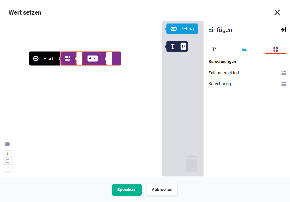 Example node "Condition" - Configure workspace - Popup "Set value" - Trash
1.1.2. Popup "Set Value" Sidebar
Show/hide sidebar → The sidebar can be shown/hidden by clicking the action icon "arrow with vertical bar".
In the displayed sidebar, placeholders for input, for a field, for calculations and functions can be selected.
The placeholders are specified by the system and depend on the source field and/or node.
A separate tab in the sidebar is available for each type of placeholder:
- Input → Placeholder for manual input (examples):
- Text
- Date
- Time
- Number
- Field → Fields from a module
- Calculations → Placeholder for configurable calculations:
- Calculate time (with field)
- Rounding
- Time difference (calculate time with field or number)
- Calculation
- Calculate time (with number)
- Functions → Insert functions:
- Concatenate
- Day/month as text
- Day/month/year as number
- Insert line
- Current date
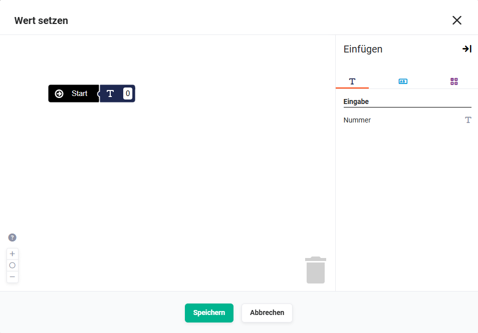 Example node "Condition" - Popup "Set value" - Sidebar tab "Input"
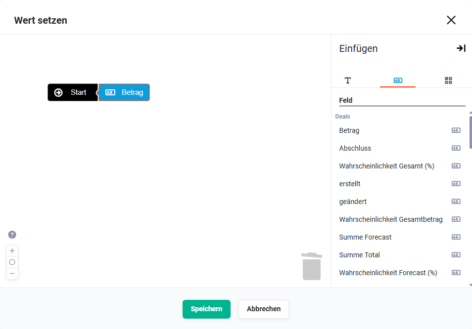 Example node "Condition" - Popup "Set value" - Sidebar tab "Field"
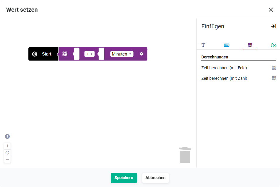 Example node "Action" - Condition popup "Set value" - Sidebar tab "Calculations"
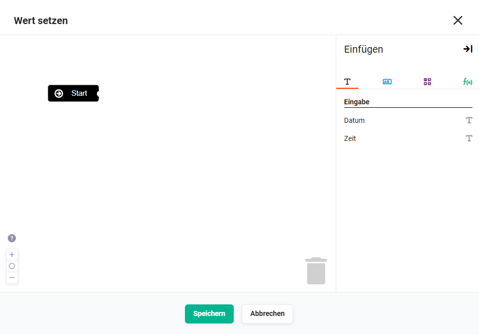 Example node "Action" - Action popup "Set value" - Tab "Input"
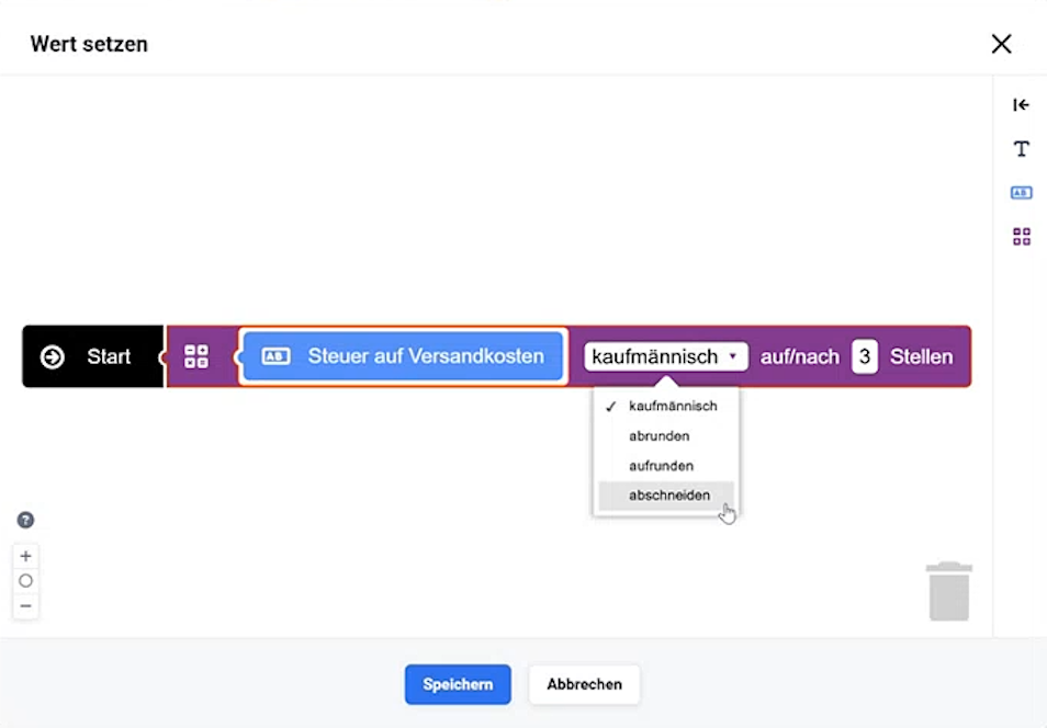 Example node "Action" - Action popup "Set value" - Tab "Calculation"
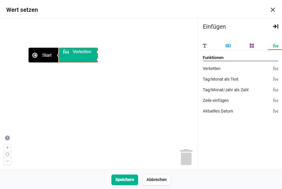 Example node "Action" - Action popup "Set value" - Tab "Functions" - Concatenate
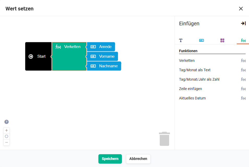 Example node "Action" - Action popup "Set value" - Tab "Functions" - Concatenate example
By clicking a placeholder, it is inserted into the editor area and can then be positioned in the editor via drag & drop.
Based on the field type of the selected field, only available placeholders are offered by the system.
Similar to a puzzle, the individual placeholders can be connected to each other or inserted into each other.