
Layout
Package: BASIC
1. General
A "layout" refers to the presentation of a record in the detail view, concerning the display and positioning of fields and blocks.
A layout additionally defines which actions are available and which fields are displayed when viewing and selecting records.
Layouts can be adapted to the needs and processes of users and groups to present records more clearly, which in turn promotes a more efficient way of working.
In the "Layout" tab, all layout settings (detail view of a record) are managed. Existing layouts can be edited and new layouts can be created.
2. Layout Overview
In the "Layout" tab, all existing layouts are displayed as tiles.
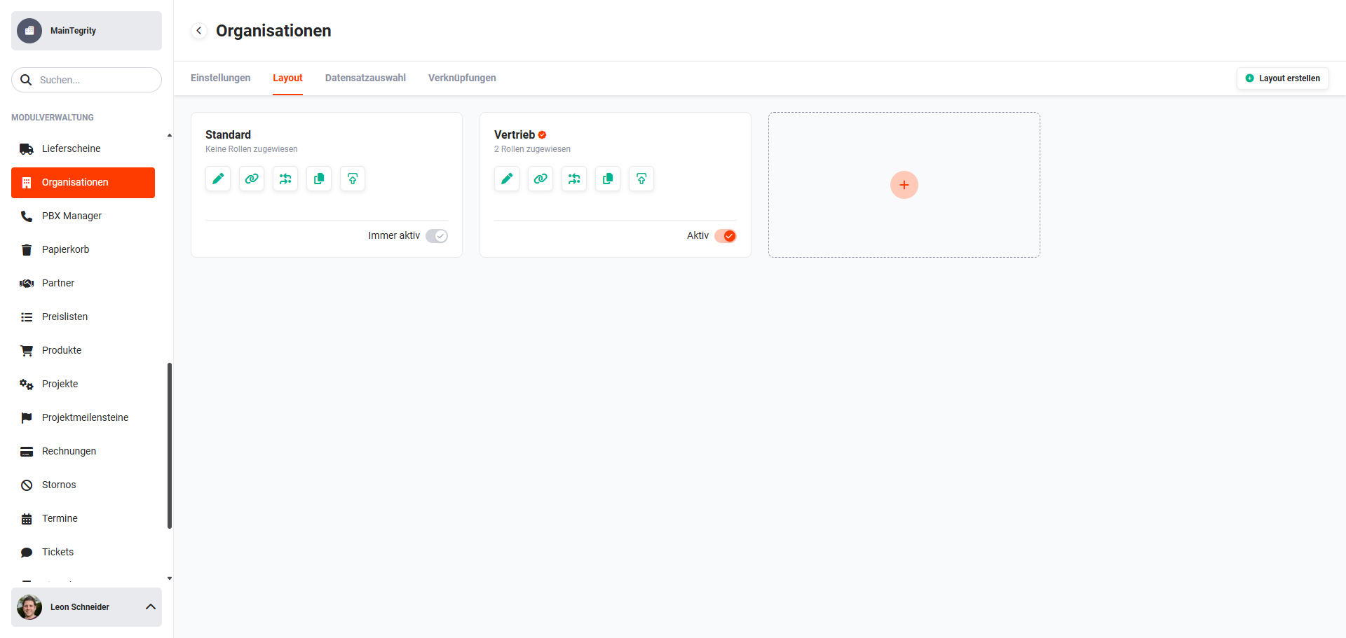 Module Management – Tab "Layout"
Each tile (layout) has the following functionalities:
- Display Name/Layout → Name of the layout
- Display default view → if the layout has been set as the default view, the "checkmark" icon is displayed
- Display assigned roles → if the layout is role-specific, the number of assigned roles is displayed
- Action icon "Delete" → Delete the layout (icon is only displayed on mouseover of the tile)
- Action icon "Edit" → opens the "Layout" tab in edit mode
- Action icon "Configure relations" → opens the popup window "Configure relations"
- Action icon "Edit actions" → opens the popup window "Edit actions"
- Action icon "Copy" → opens the popup window "Copy view"
- Action icon "Edit header actions" → opens the popup window "Edit header actions"
- Toggle "Active" → Activate/deactivate layout
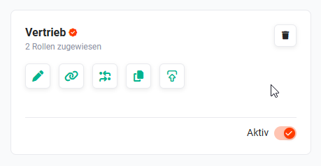 Layout tile with action icons
3. Create Layout
To create a new layout, either click the "Create layout" button, or click the "Plus" action icon in an "empty" tile.
The creation view of a new layout is divided into two areas:
- Basic settings → Name of the layout and definition as default view
- Assign roles → Assignment of roles that can use the layout
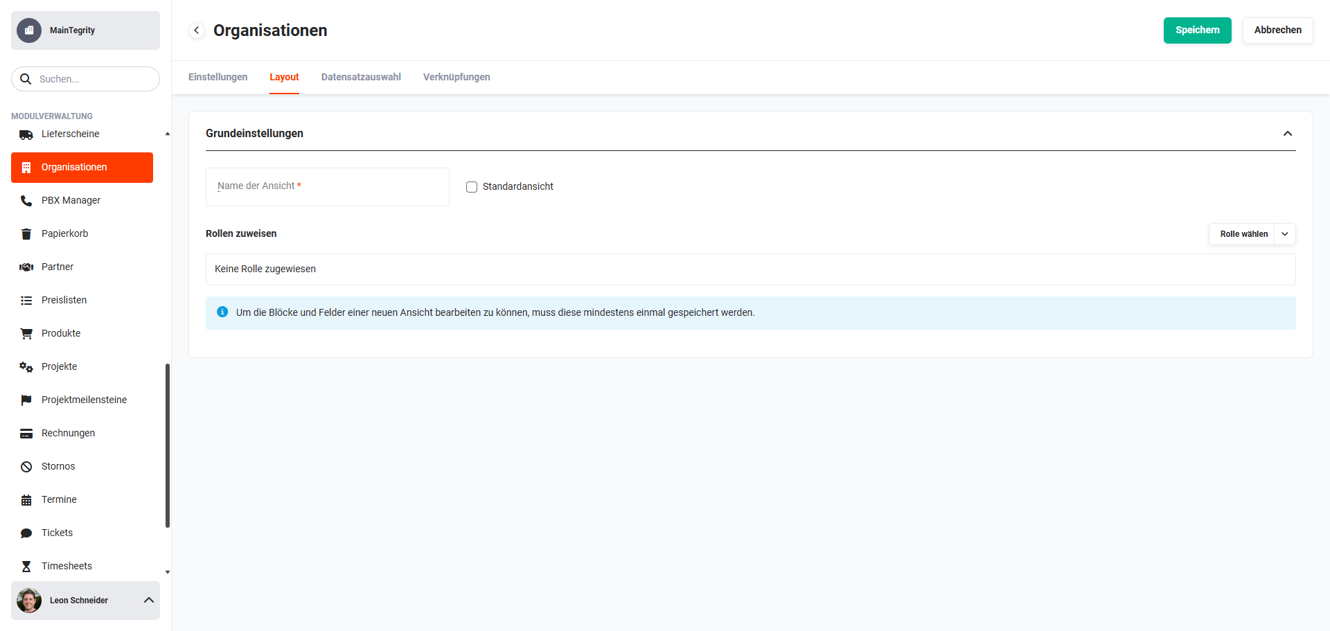 Creation view of a new layout
To be able to edit the blocks and fields of a new layout, it must be saved at least once.
Layouts can be set to active directly when creating them.
3.1. Basic Settings
In the basic settings, the name of the layout is defined.
Using the "Default view" checkbox, it can be defined whether the layout should be displayed as the default view for all users.
Each user can — despite the "Default view" setting — individually define which layout they want to use as their default view.
3.2. Assign Roles
A layout can optionally be assigned roles. The layout is then only available to users belonging to those roles.
If no role has been assigned, the layout is available to all users.
3.3. Configure Layout
Once a new layout has been saved for the first time, the configuration of blocks and fields can now take place.
The "Standard" layout serves as the basis for the new layout.
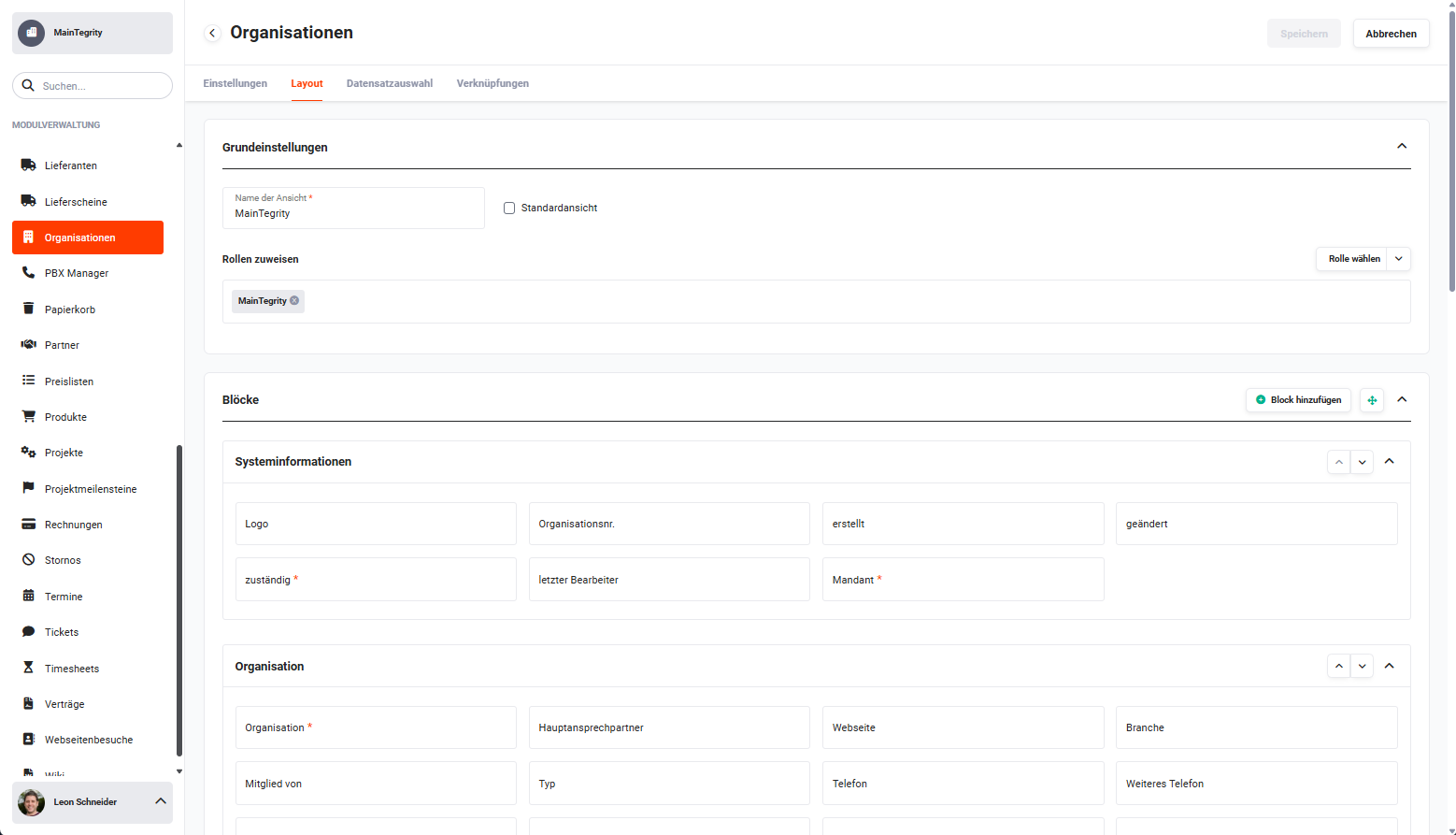 Module Management – Layout configuration
The further configuration of blocks and fields is identical to that described in the section Edit Layout.
4. Edit Layout
After clicking the action icon "Edit" (pencil icon) in the tile of a layout, the "Layout" tab opens in edit mode for the layout.
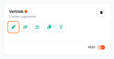 Edit layout action
In the "Layout" tab in the blocks and fields area, the following configurations/actions can be performed:
- Add block → Button "Add block"
- Arrange blocks → Action icon "four arrows"
- Hidden fields → Action icon "crossed-out eye"
- Add custom field → Action icon "Plus"
- Delete block → Action icon "Recycle bin"
- Edit block → Action icon "Pencil"
- Move up → Action icon "pointed arrow up"
- Move down → Action icon "pointed arrow down"
- Expand/collapse → Action icon "pointed arrow up"
- Delete field → Action icon "Recycle bin"
- Edit properties → Action icon "Pencil"
The actions within a block in the "Layout" tab are only displayed on mouseover of a block.
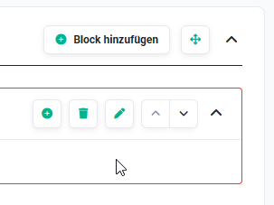 Example: Layout tab – Block actions
4.1. Basic Settings
In the basic settings, the name of the layout is defined.
Using the "Default view" checkbox, it can be defined whether the layout should be displayed as the default view for all users.
Each user can — despite the "Default view" setting — individually define which layout they want to use as their default view.
4.1.1. Assign Roles
A layout can optionally be assigned roles. The layout is then only available to users belonging to those roles.
If no role has been assigned, the layout is available to all users.
When roles are added/removed, the layout is accordingly available, or no longer available, to certain users/roles.
4.2. Blocks
A "block" refers to the — usually thematic — grouping of fields in an area delimited by a frame.
4.2.1. Add Block
Two options are available to add a new block:
- Button "Add block" → opens the popup "Add block"
- Action icon "Plus" (only displayed on mouseover of the area between two blocks) → opens the popup "Add block"
The following fields are available in the popup "Add block":
- Block name (DE German) → Name of the block
- Block name (other languages) → Translations of the block name into other languages
- Insert after → Dropdown list with the already existing blocks
- Number of columns → Dropdown list to set the number of columns (values: Dynamic, 2–6 columns)
- Display status → Dropdown list for defining the display status of the block (values: expanded, collapsed and hidden)
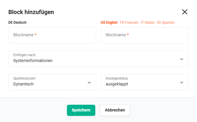 Popup "Add block"
After clicking the "Save" button, the new block is created and displayed. In the next step, custom fields can be added.
4.2.2. Arrange Blocks
Two options are available to arrange blocks:
- Action icon "Arrange blocks" (icon "four arrows") → opens the popup "Arrange blocks", in which blocks can be repositioned using Drag & Drop
- Action icons (in the top right corner of each block)
- "Move up" (icon "pointed arrow up") → moves the block up by one position with each click
- "Move down" (icon "pointed arrow down") → moves the block down by one position with each click
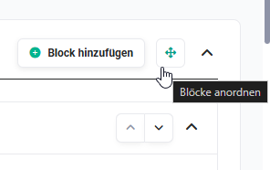 Action icon "Arrange blocks"
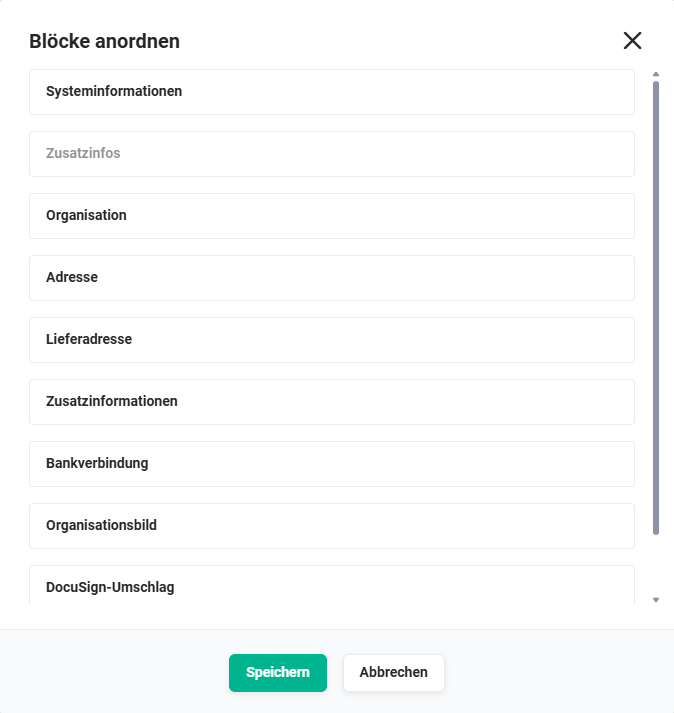 Popup "Arrange blocks"
4.2.3. Delete Block
The actions within a block are only displayed on mouseover of a block.
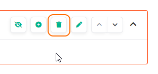 Action icon "Delete block"
After clicking the action icon "Delete block" (recycle bin icon), a popup with the query "Do you really want to delete the block?" is displayed.
After clicking the "Confirm" button, the block is deleted.
Only blocks that no longer contain any fields can be deleted!
If an attempt is made to delete a block that still contains fields, a corresponding notice is displayed. The popup shows which layouts are affected.
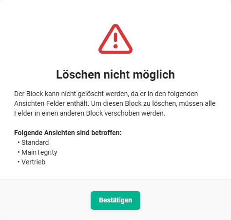 Popup "Delete block not possible"
4.2.4. Edit Block
The actions within a block are only displayed on mouseover of a block.
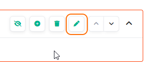 Action icon "Edit block"
After clicking the action icon "Edit block" (pencil icon), the popup "Edit block" opens.
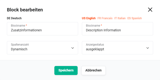 Popup "Edit block"
The following fields are available in the popup "Edit block":
- Block name (DE German) → Name of the block
- Block name (other languages) → Translations of the block name into other languages
- Number of columns → Dropdown list to set the number of columns (values: Dynamic, 2–6 columns)
- Display status → Dropdown list for defining the display status of the block (values: expanded, collapsed and hidden)
If a block contains required fields, the block cannot be hidden.
4.2.5. Expand/Collapse
The actions within a block are only displayed on mouseover of a block.
 Action icon "Expand/collapse block"
By clicking the action icon "Expand/collapse block" (icon "pointed bracket up/down"), a block can be expanded or collapsed.
Expanding and collapsing in the layout manager serves exclusively to improve clarity when editing the layout in the Global Settings, and has no influence on the display in the detail view. The actual initial state of a block in the detail view, as well as in the edit view, is defined exclusively via the block editing.
4.3. Fields
4.3.1. Hidden Fields
The actions within a block are only displayed on mouseover of a block.
Fields can be deactivated in the field settings (checkbox "Active"). Deactivated fields are then considered "hidden".
If hidden fields are present in a block, the action icon "hidden fields" (icon "crossed-out eye") is available.
 Action icon "Hidden fields"
After clicking the action icon "hidden fields" (icon "crossed-out eye"), the popup "Hidden fields" opens.
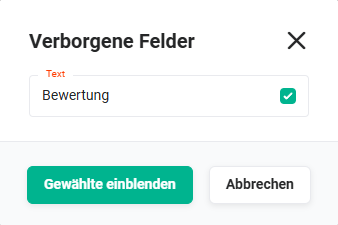 Popup Hidden fields
All hidden fields are listed in the popup. Using the checkbox, the fields to be shown can be selected and made visible again using the "Show selected" button.
4.3.2. Add Custom Field
The actions within a block are only displayed on mouseover of a block.
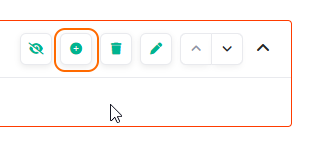 Action icon "Add custom field"
After clicking the action icon "Add custom field" (plus icon), the popup "Add custom field" opens.
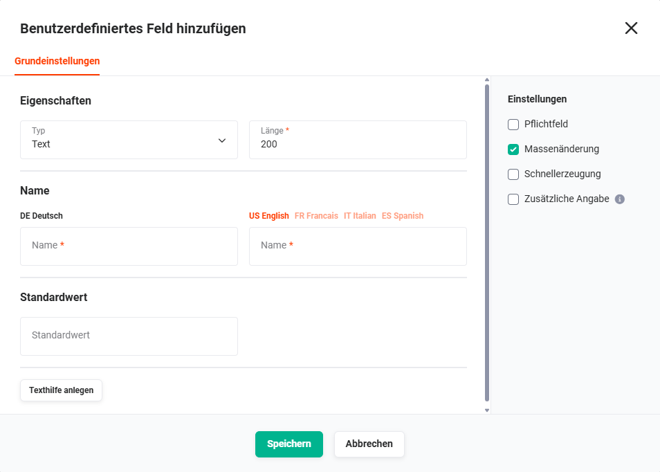 Popup "Add custom field"
The popup is divided into two areas:
- Basic settings → Properties, Name, Default value and Create tooltip
- Settings → Required field, Mass update, Quick create and Additional information
4.3.2.1. Basic Settings
4.3.2.1.1. Properties
Using the "Type" dropdown list, the field type is defined. For certain field types, additional configuration options for the field are available, which are automatically displayed after the field is selected.
The following field types are available:
- Text → Standard text field
- Further configuration options: Length (max. number of characters)
- Number → Field for entering numbers
- Further configuration options: Length (max. number of characters), Decimal places (number of decimal places)
- Percent → Field for entering percentage values
- Further configuration options: none
- Currency → Field for entering amounts
- Further configuration options: none
- Date → Date field
- Further configuration options: Expression (Date, Date and time and Time), Use current time as default (if checkbox is checked, the field is pre-filled with the current time)
- Email → Field for entering email addresses (checked for correct syntax when entered/saved and displayed as a hyperlink)
- Further configuration options: none
- Phone → Field for entering phone numbers (displayed as a hyperlink if a telephony connection has been configured in PBX Manager)
- Further configuration options: none
- Fax → Field for entering fax numbers (displayed as a hyperlink if a telephony connection has been configured in PBX Manager)
- Further configuration options: none
- Dropdown list → Field for selecting predefined dropdown values → see Note on dropdown values
- Further configuration options: Allow creation of new values (if checkbox is checked, users with the corresponding profile permission can create new values in this dropdown list)
- Additional configuration options: Variable required fields and Dropdown dependencies → see Note Dropdown list
- Reference → Existing records can be selected from other modules, thus creating references (links) to other modules
- Further configuration options: Target modules (selection of one or more target modules), Default (default for selecting a record, only displayed when multiple target modules are selected)
- URL → Field for entering URLs/web addresses (displayed as a hyperlink)
- Further configuration options: none
- Checkbox → Checkbox/toggle field
- Further configuration options: none
- Text area → Field for entering multi-line text
- Further configuration options: Width (narrow/wide), HTML formatting (if checkbox is checked, a toolbar for text formatting is displayed)
- Additional configuration options (when HTML formatting is enabled): Default font, Default font size
Define the font or font size with which a new record is pre-filled in this field. The available values are taken from the editor configuration and are automatically extended as soon as further languages or font sizes are added there.
- Multi-select box → Field for selecting multiple predefined dropdown values → see Note on dropdown values
- Further configuration options: Allow creation of new values (if checkbox is checked, users with the corresponding profile permission can create new values in this dropdown list)
- Additional configuration options: Variable required fields → see Note Dropdown list
- File → Upload field for uploading files into the brainX system
- Further configuration options: Width (narrow/wide), File types (selection of allowed file types, no selection means all file types are allowed), Multiple upload (upload of multiple files is allowed)
- User selection → Field for selecting all (active) users
- Further configuration options: none
For a dropdown list (field type "Dropdown list" and "Multi-select box"), multiple field values can be entered in the "Dropdown values" area when creating the field. When a new field value is entered, another input field automatically opens.
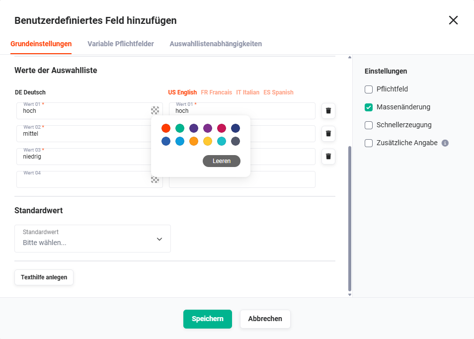 Popup "Add custom field" – Dropdown values
A colour picker is available in the name input field of a dropdown value, which can be used to define a colour for the dropdown value.
If the dropdown list column is displayed in a module's list view, the field value in the list view is highlighted in the selected colour.
This enables an excellent visual overview in list views.
For the field types "Dropdown list" and "Multi-select box", additional tabs for configuration are available in the popup "Add custom field":
- Tab "Variable required fields" (field types "Dropdown list" and "Multi-select box")
- Tab "Dropdown dependencies" (field type "Dropdown list")
Tab "Variable required fields"
Before configuration is possible, at least one dropdown value must exist.
The "Variable required fields" settings item provides the ability to define selected fields as required fields depending on a dropdown value.
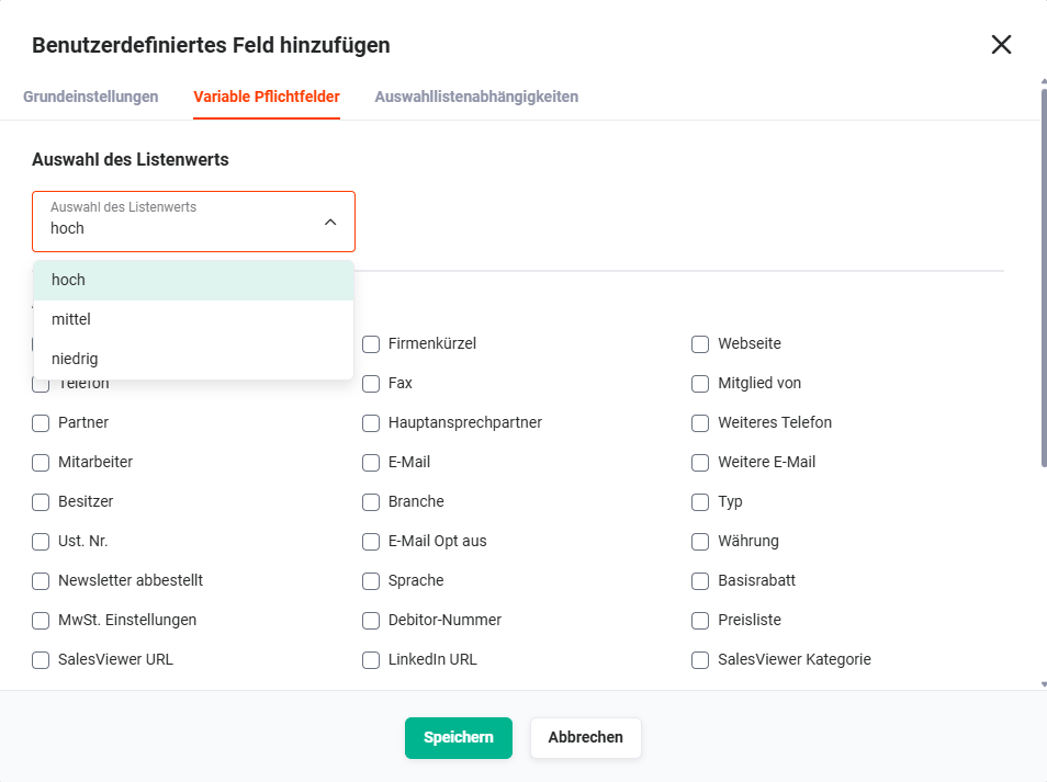 Popup "Add custom field" – Tab "Variable required fields"
Once a dropdown value has been selected in the "Select list value" area, an overview of all fields that can be defined as required fields is displayed in the lower "Select required fields" area.
Using the checkbox next to each field in the "Select required fields" area, it is defined which fields are required when the corresponding dropdown value is selected in the create or edit mode of a record.
Fields on which a variable required field function is configured can no longer be edited via the Quick Edit and mass edit functions.
If a dropdown value is deleted in the layout manager, all associated required field configurations are irrevocably removed.
[CSV imports]() and [CSV updates]() — which contain fields or dropdown values for which variable required fields have been defined — are executed without the corresponding check!
Before configuration is possible, at least one dropdown value must exist.
In the "Dropdown dependencies" tab, it can be defined which dropdown values are available in other dropdown lists when a specific dropdown value has been selected in the dropdown list.
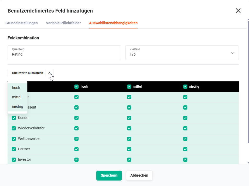 Popup "Add custom field" – Tab "Dropdown dependencies"
At least one entry per column must be selected in the target field, otherwise the dependency cannot be created.
If a dropdown dependency is configured, the source and target field are no longer available for the Quick Edit function. These fields therefore cannot be edited individually either in the [list view]() or in the [detail view](). The dropdown lists can only be changed in the edit mode of a record.
Dropdown dependencies only apply in the edit mode of a record and not when executing [background tasks]() or [automations]()!
The "Transfer field values" tab is only available in the Leads module.
Using the action "Convert lead" in the [Leads]() module, a record can be converted. Converting means the lead record is deleted and a new record is automatically created in the [Contacts]() module. Optionally, additional records can also be created in the [Organizations](), [Partner](), [Deals](), [Appointments]() and [Tasks]() modules.
Custom fields that should be considered during conversion can be configured in the popup "Add custom field – Tab Transfer field values".
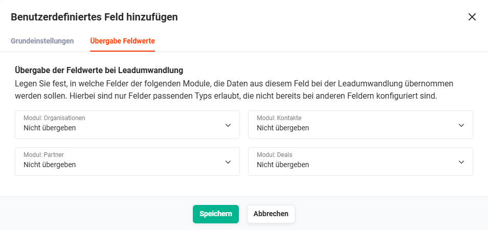 Popup Add custom field – Tab Transfer field values
In the "Transfer field values" tab, it is defined into which modules the data from this field should be transferred during lead conversion. Only fields of the appropriate type are permitted that have not already been configured for other fields.
For the four modules
- Module: Organizations
- Module: Contacts
- Module: Partner
- Module: Deals
it can be defined separately whether and into which target field the field value should be transferred during conversion. In each of the four dropdown lists, in addition to the existing fields of the respective target module, the following default values are also available for selection:
- Do not transfer → The field value is not transferred to the target module during conversion.
- Create field and transfer → A new field with an identical field type and name is automatically created in the target module and the field value is transferred there. The new field is added to the default block of the default view of the respective target module.
4.3.2.1.2. Name
In the "Name" area, the display name of the field is defined multilingually in the "Name" field.
4.3.2.1.3. Default Value
In the "Default value" area, it is possible for predefined field types to assign a default value. This means that when a record is created, the field is pre-filled with this value.
4.3.2.1.4. Create Tooltip
Optionally, a so-called "tooltip" can be created for fields. If a tooltip has been configured, the "i" icon is displayed next to the field in the edit view of a record.
On mouseover of the icon, the tooltip is displayed.
After clicking the "Tooltip" button, a text area is displayed in which the tooltip can be entered in multiple languages.
A tooltip is helpful for many users when the field name alone may not be sufficiently descriptive and can provide users with a filling guide.
Short instructions or general notes about the field are also helpful for many users.
4.3.2.2. Settings
In the popup "Add custom field", the "Settings" area is displayed on the right side, in which additional configurations for a field are available.
4.3.2.2.1. Required Field
Required fields are marked with a red asterisk * in the create and edit view of a record.
A record cannot be saved if a required field does not contain a valid value!
If a dropdown dependency exists between two fields of the dropdown list type, the target field of this dropdown dependency cannot be defined as a required field!
4.3.2.2.2. Mass Update
In list views of modules, the mass edit action is available.
If the "Mass update" setting is activated, the field is also available accordingly in the mass edit function.
4.3.2.2.3. Quick Create
At various points in the brainX system, new records can be created using the so-called "Quick create" function (e.g. action "Create" in the Navigation bar). This means that only a popup window with the most important fields is displayed, instead of the create view of a new record.
If the "Quick create" setting is activated, the field is also available accordingly in the popup window.
4.3.2.2.4. Additional Information
If the "Additional information" setting is activated, the field is not available in the main data entry form, but is displayed in a separate sidebar in the detail view of a record.
The button to show and hide the "Additional information" sidebar is permanently displayed in the detail and edit view – regardless of whether the mouse cursor is over the area. This button can also be used to directly deactivate the "Additional information" setting for the respective field.
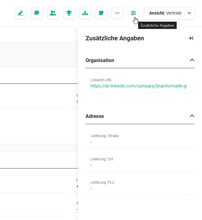 Detail view – Sidebar "Additional information"
The "Additional information" setting is suitable for fields that
- are rarely used
- are fields/helper fields for automations
4.3.2.2.5. Organisation-related
The "Organisation-related" settings item is only displayed in the Contacts module.
In addition to a main organisation, further organisations can be referenced for a contact in the "Organisation" reference field. If a different organisation is selected in the detail view of a Contacts record, the record is reloaded. The respective organisation-related values of these fields are then displayed. The values of the "organisation-related data" therefore have a direct dependency on the selected organisation.
On the one hand, there are fields that are already marked as organisation-related by the brainX system by default; on the other hand, new custom fields can also be marked as "organisation-related" when created in the Module Manager.
Organisation-related fields can be moved to any block in the "Module Management – Layout" settings item and do not necessarily have to be in the "Organisation-related data" block.
However, it is recommended to place organisation-related fields in the "Organisation-related data" block, as there is no visual marking for organisation-related fields. If a different organisation is selected in the organisation-related "Organisation" field, the page is reloaded and the organisation-related fields may have a different or possibly no value. This can lead to confusion if one or more organisation-related fields are in a different block, as the change in field values may go unnoticed.
4.3.2.2.6. Audit-proof
The "Audit-proof" settings item is only displayed in the Products and Services modules.
Audit-proof fields are necessary to comply with legal requirements, prevent manipulation, ensure transparency and create legal certainty.
Audit-proof fields cannot be deleted.
Audit-proof fields can be used in PDF templates within position groups.
4.3.2.2.7. Active Languages
The "Active languages" settings item is only displayed in the Products and Services modules.
Once a multilingual field exists, the default language of the system can no longer be changed!
In addition to the default language, further languages for the custom field can be activated here.
4.3.3. Delete Field
The actions for a field are only displayed on mouseover of the field.
 Action icon "Delete field"
After clicking the action icon "Delete field", a popup with the query "Do you really want to delete?" is displayed.
After clicking the "Confirm" button, the field is deleted.
When deleting a field, a notice may appear indicating that the field cannot be deleted because it is still in use. The notice informs about the specific places where it is used, e.g. in an automation, a report or a list view. The field can only be deleted after it has been removed from all listed places.
In some cases, it may additionally be necessary to delete records from the Recycle Bin module before a field can be finally deleted. This affects fields that were used in records that have already been deleted but not yet permanently removed from the Recycle Bin.
The fields present in the system at delivery can be adapted differently in Layout depending on the field type. Fields that are not needed can be deleted from the layout, deactivated via the field properties (checkbox "Active") or hidden by adjusting the display status of a block.
If certain user groups should have different fields or field arrangements available, a new layout can be created and assigned to the corresponding role.
Whether a field can be deleted, deactivated or hidden depends on the respective field type and whether the field is defined as a required field by the system.
4.3.4. Edit Properties
The actions for a field are only displayed on mouseover of the field.
 Action icon "Edit properties"
After clicking the action icon "Edit properties" (pencil icon), the popup "Edit properties" opens.
4.3.4.1. Tab Basic Settings
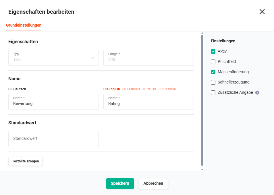
The popup "Edit properties" offers exactly the same functionalities as when creating a custom field.
The exception here is the "Type" field and the length of a field, which cannot be changed retrospectively.
The popup "Edit properties" provides the same options as when creating a custom field — with the exception that the type and length of a field cannot be changed retrospectively.
4.3.4.2. Tab Transfer Field Values
The "Transfer field values" tab in the popup "Edit properties" is only available in the Leads module!
Using the action "Convert lead" in the Leads module, a record can be "converted". Converting means the lead record is deleted and a new record is automatically created in the Contacts module.
Optionally, additional records can also be created in the Organisations, Partners, Deals, Appointments and Tasks modules.
In the "Transfer field values" tab, it is defined into which modules the data from this field should be transferred during lead conversion. Only fields of the appropriate type are permitted that have not already been configured for other fields.
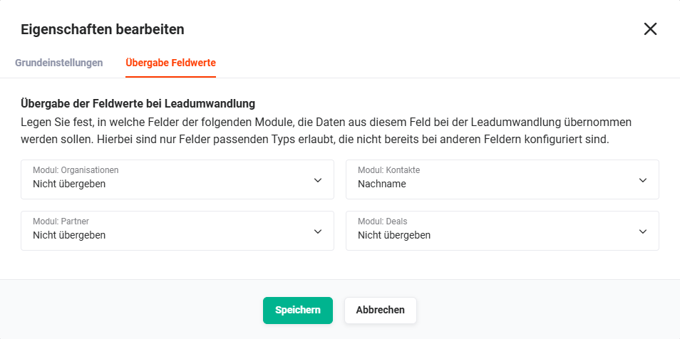 Popup Edit properties – Tab Transfer field values (Leads module)
In the four dropdown lists
- Module: Organisations
- Module: Contacts
- Module: Partners
- Module: Deals
it is defined whether the field values should generally be transferred, and into which fields the values are transferred.
4.3.5. Move Field
Fields can be moved both within a block and to other blocks using Drag & Drop.
5. Configure Relations
Using the action "Configure relations", the modules are configured that are displayed in the detail view of a record in the Tab "Relations" in the respective layout.
 Action icon "Configure relations"
After clicking the action icon "Configure relations" (chain links icon) in the tile of a layout, the popup window "Configure relations" opens.
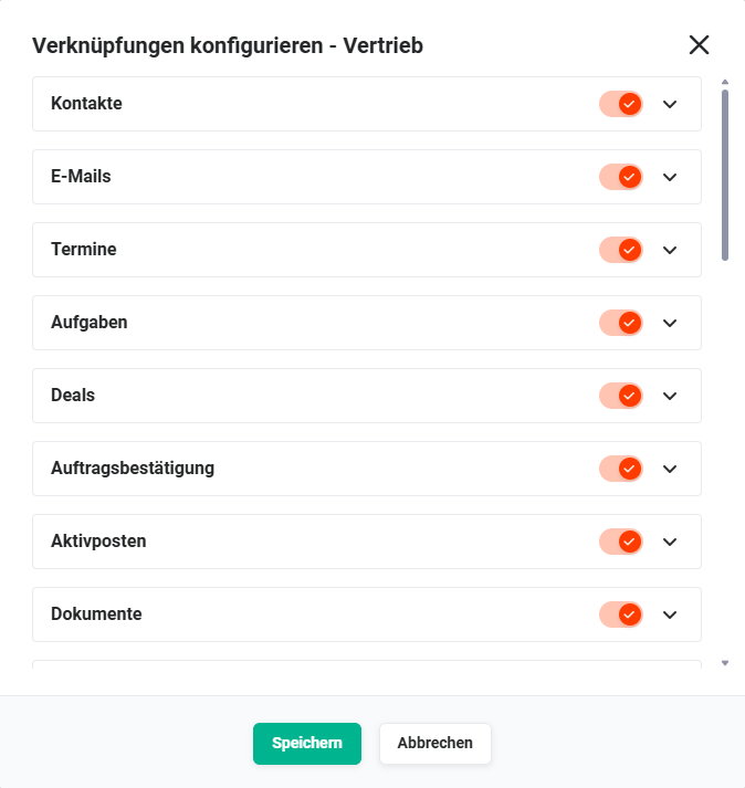 Popup Configure relations
Using the toggle, it can now be configured which modules should be displayed.
The order in which the modules are displayed in the "Relations" tab can be set using Drag & Drop.
After clicking an action icon "Advanced configuration" (pointed bracket icon), the area expands to allow further configurations.
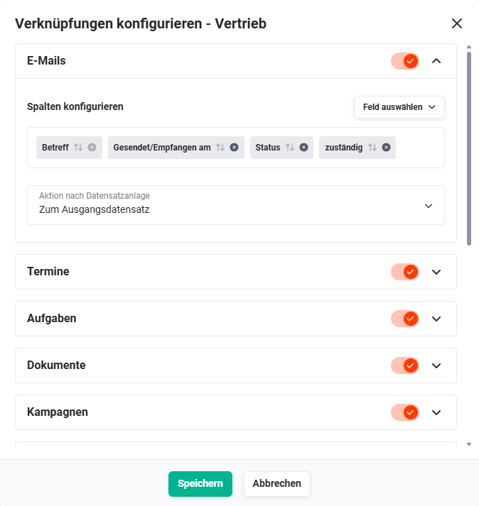 Popup Configure relations – Advanced configuration
The following configuration items are available:
- Configure columns → Configuration of the columns to be displayed for the module. Fields can be sorted by Drag & Drop. Using the "Add field" button, additional fields can be selected for display. To remove a field, click the action icon "Remove field" (x icon) of the respective field.
- Field "Action after record creation" (dropdown list) → If the action icon "create record (module name)" is clicked for a module in the "Relations" tab, a new record can be created for that module. In the field "Action after record creation", it is configured what happens after the new record is created:
- Return to source record → After creating the new record, the record from which the action was started is displayed again.
- Go to new record → After creating the new record, the newly created record is displayed.
6. Edit Actions
Using the action "Edit actions", the actions are configured that are displayed in the detail view of a record after clicking the "Actions" button in the flyout menu.
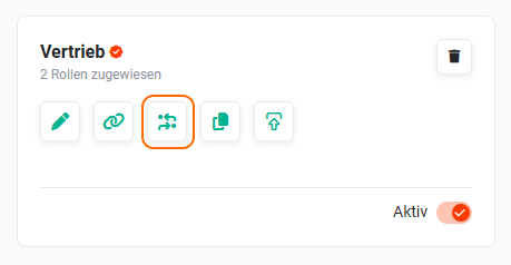 Action icon "Edit actions"
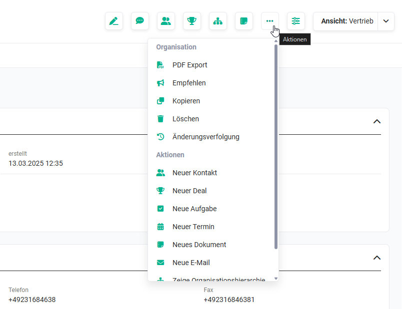 Detail view with flyout menu of actions
After clicking the action icon "Edit actions" (icon "two arrows with dot"), the popup "Edit actions" opens.
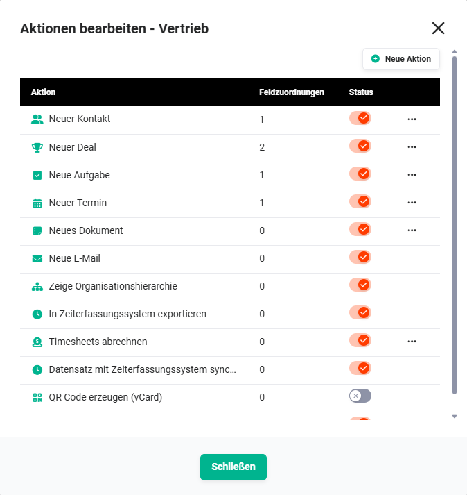 Popup "Edit actions"
The popup displays all existing actions in a four-column list view:
- Action → Icon and name of the action
- Field mappings → Number of existing field mappings
- Status → Display of the status (active/inactive) as a toggle to set the status of the action (active/inactive)
- Actions → Action icon "three dots" to display a flyout menu with further actions for the respective action (Whether and which actions are displayed depends on the respective action and the module concerned.)
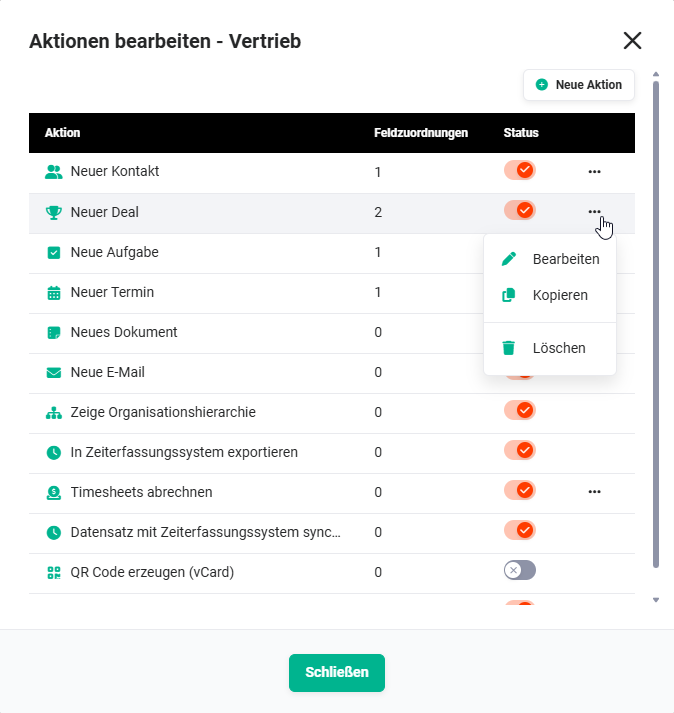 Popup "Edit actions" – Flyout menu with actions
Using the actions in the flyout menu, actions can be edited, copied or deleted. Whether and which actions are displayed depends on the respective action and the module concerned.
Actions with the status "inactive" are still available in Automations!
New Action
Using the "New action" button, new actions can be added. After clicking the "New action" button, the popup "New action" opens.
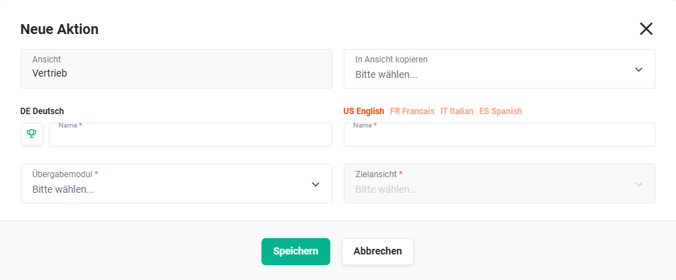 Popup "New action"
The following fields are available for configuration:
- View → Name of the layout for which the action is created (display only)
- Copy to view → Selection of further layouts/views to which the action should be copied
- DE German → Selection of the icon (see screenshot "Popup "New action" – Select icon" below) and input field for the name of the action in German
- Languages → Input field for entering the translation of the name in further languages
- Transfer module → Selection of the transfer module (create view in this module is opened)
- Target view → Selection of the layout to be opened in the transfer module
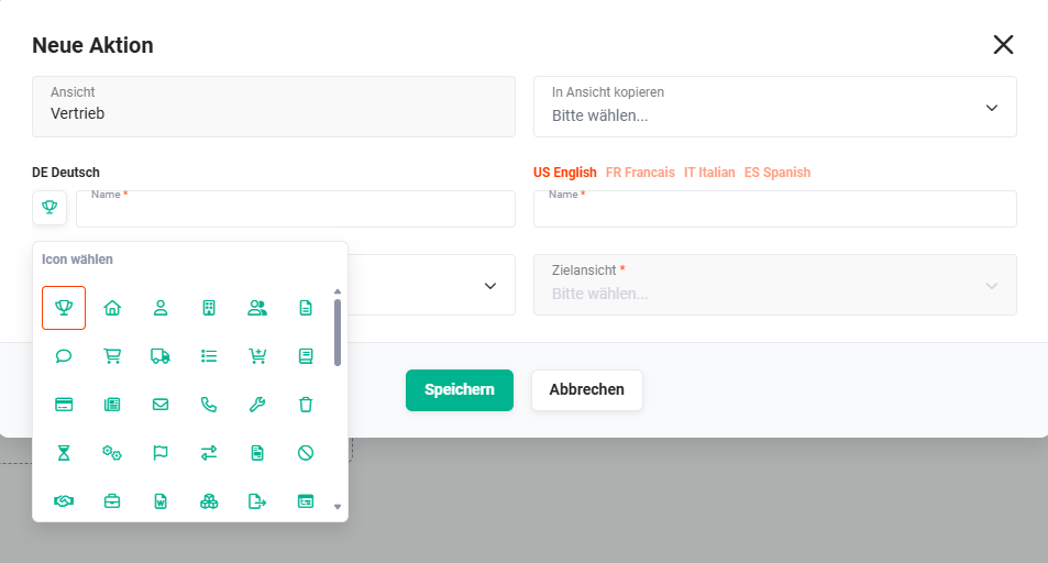 Popup "New action" – Select icon
7. Copy Layout
Using the action "Copy layout", complete layouts can be copied to create new layouts that are very similar to the current layout.
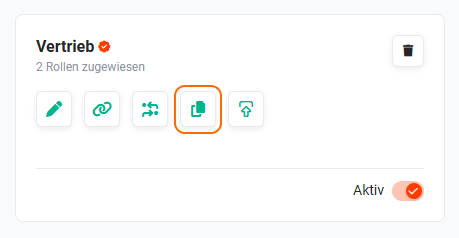
After clicking the action icon "Copy layout" (icon "two sheets"), the popup "Copy view" opens.
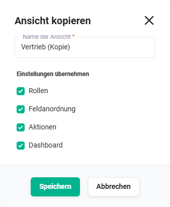 Popup "Copy view"
The following settings can be adopted:
- Roles → assigned roles are adopted
- Field arrangement → the existing field arrangement is adopted
- Actions → all configured actions are adopted
- Dashboard → configuration settings of the dashboard are adopted
After clicking the "Save" button, the edit view of the copied layout is displayed for further configuration.
All functionalities as described in the section Edit Layout are available.
8. Edit Header Actions
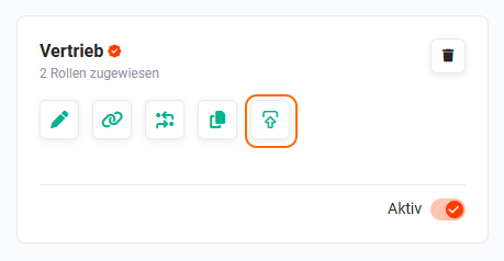
Using the action "Edit header actions", the action icons displayed in the header area of the detail view can be configured.
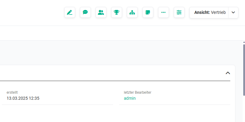 Detail view – Header actions
After clicking the action icon "Edit header actions" (icon "arrow up"), the popup "Edit header actions" opens.
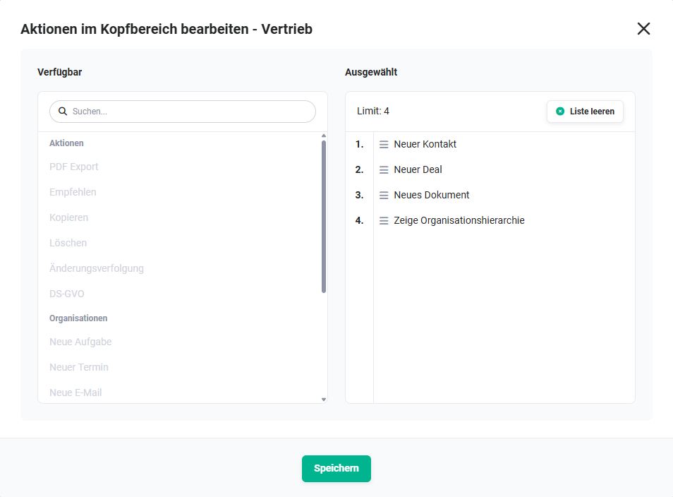 Popup "Header actions"
The popup "Edit header actions" is divided into two columns:
- Available → Selection of the action to be displayed in the header area (limit = 4 actions); selection is made by clicking the action
- Selected → Display of the selected actions
- Actions can be sorted using Drag & Drop
- On mouseover of an action, the "x" action icon is displayed, which can be used to remove the action from the selected column.
Using the "Clear list" button, all actions in the "Selected" column are removed.
9. Layout Active/Inactive
Using the toggle "Active/Not active", it is configured whether the layout is generally active/not active.
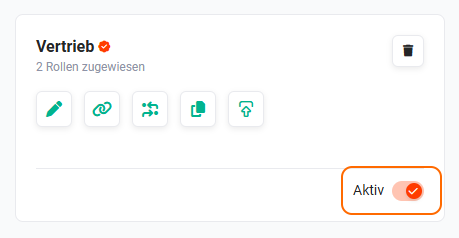
Inactive layouts are no longer available to users when selecting a layout.
10. Delete Layout
Using the action "Delete", the complete layout can be deleted.
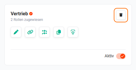
After clicking the action icon "Delete" (recycle bin icon), a popup with the query "Do you really want to delete the view "Name-of-the-view"?" is displayed.
After clicking the "Confirm" button, the layout is permanently deleted.
Deleted layouts are permanently deleted and cannot be restored!
11. Practical Examples
1 – Role-specific layout: sales team sees only sales-relevant fields
A company wants all users in the "Sales Representative" role to see a simplified view in the Contacts module that shows only the most important sales fields. A new layout is created for the "Contacts" module, and only the fields First Name, Last Name, Company, Phone, E-Mail and Sales Stage are added to the detail view. The layout is activated and assigned exclusively to the "Sales Representative" role. From this point on, all users with this role see the streamlined layout.
2 – Dropdown with color coding for ticket status
A support team wants the Ticket Status field to be visually highlighted in green (Resolved), yellow (In Progress), and red (Escalated). In the layout of the Support Tickets module, the field Ticket Status is added. For each selection value, a background color is configured. Users immediately see the color coding in both the list and detail view.
3 – Copy layout for a new department
A new "Key Account" role needs a layout similar to "Sales Representative" but with two additional fields (Account Manager and Annual Revenue). Instead of building from scratch, the existing "Sales Representative" layout is copied using Copy Layout. The copy is renamed to "Key Account" and the two additional fields are added. The layout is then assigned to the "Key Account" role.
4 – Customize related record links in the detail view
The project management team wants the Tasks and Contacts relationships to be displayed prominently at the top of the Projects detail view. In the layout editor, the Relations section is opened and the blocks Tasks and Contacts are moved to the top positions using drag & drop. After saving, the links appear at the configured position for all users with this layout.
12. Frequently Asked Questions
Can a module have multiple layouts at the same time?
Yes. Any number of layouts can be created per module. In the detail view, each user can switch between the layouts available to them via the view selector. If a role is assigned to a layout, only users with that role can see it.
Why does a user see a different layout than expected?
The displayed layout depends on which layout the user has chosen as their default view and which layouts are released for their role. Even if a layout is marked as the system-wide default view, each user can individually set a different layout as their personal default.
Why can't a block be deleted?
A block can only be deleted when it no longer contains any fields. All fields must first be moved to other blocks or removed from the layout.
What happens to data when a custom field is deleted?
All data values stored in this field are irretrievably lost. Before deletion, brainX checks whether the field is still used in Automations, Reports or list views and provides a corresponding note. The field can only be deleted after it has been removed from all the listed locations.
Can I change the field type of an existing field afterwards?
No. The type and length of a field cannot be changed after it has been created. If a different field type is required, the old field must be deleted and a new field with the desired type must be created.
What is the difference between "deactivating" a field and "deleting a field from the layout"?
Deactivating (removing the Active checkbox) hides the field without losing the stored data — the field is considered hidden and can be shown again at any time. Deleting removes the field permanently, including all stored data values.